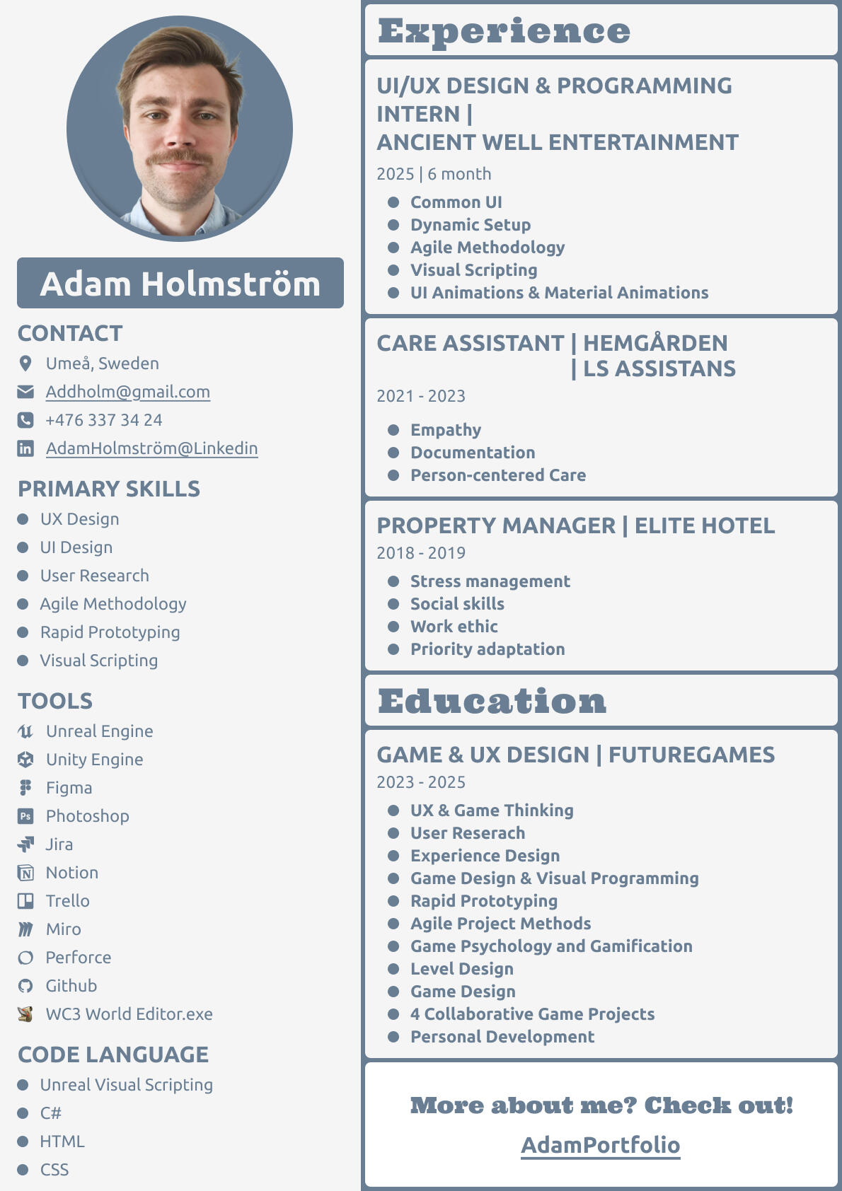

Hi, I'm Adam!
I'm a trained UX/UI designer with a solid understanding of the technical aspects of UI design. I’ve focused heavily on creating user-friendly and readable interfaces.My curiosity led me further into development, and before long, I started writing my own code. Lately, I’ve been working mostly on implementing game UI and have become highly self-sufficient in the process.I'm organized, results-oriented, and bring a strong work ethic to everything I do.When I’m not designing, you’ll find me writing music, playing board games, or diving into computer games. In the summer, I love exploring the forest in search of nature’s hidden treasures.


Commercial Projects
UX/UI Design | UI Programming
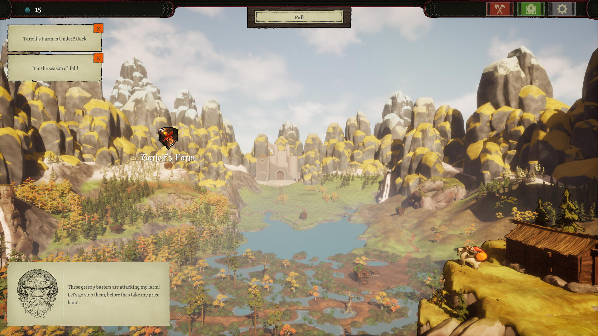
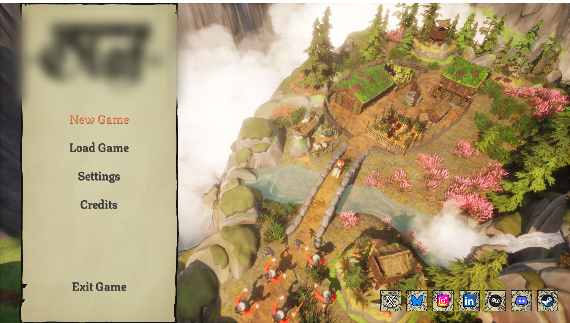
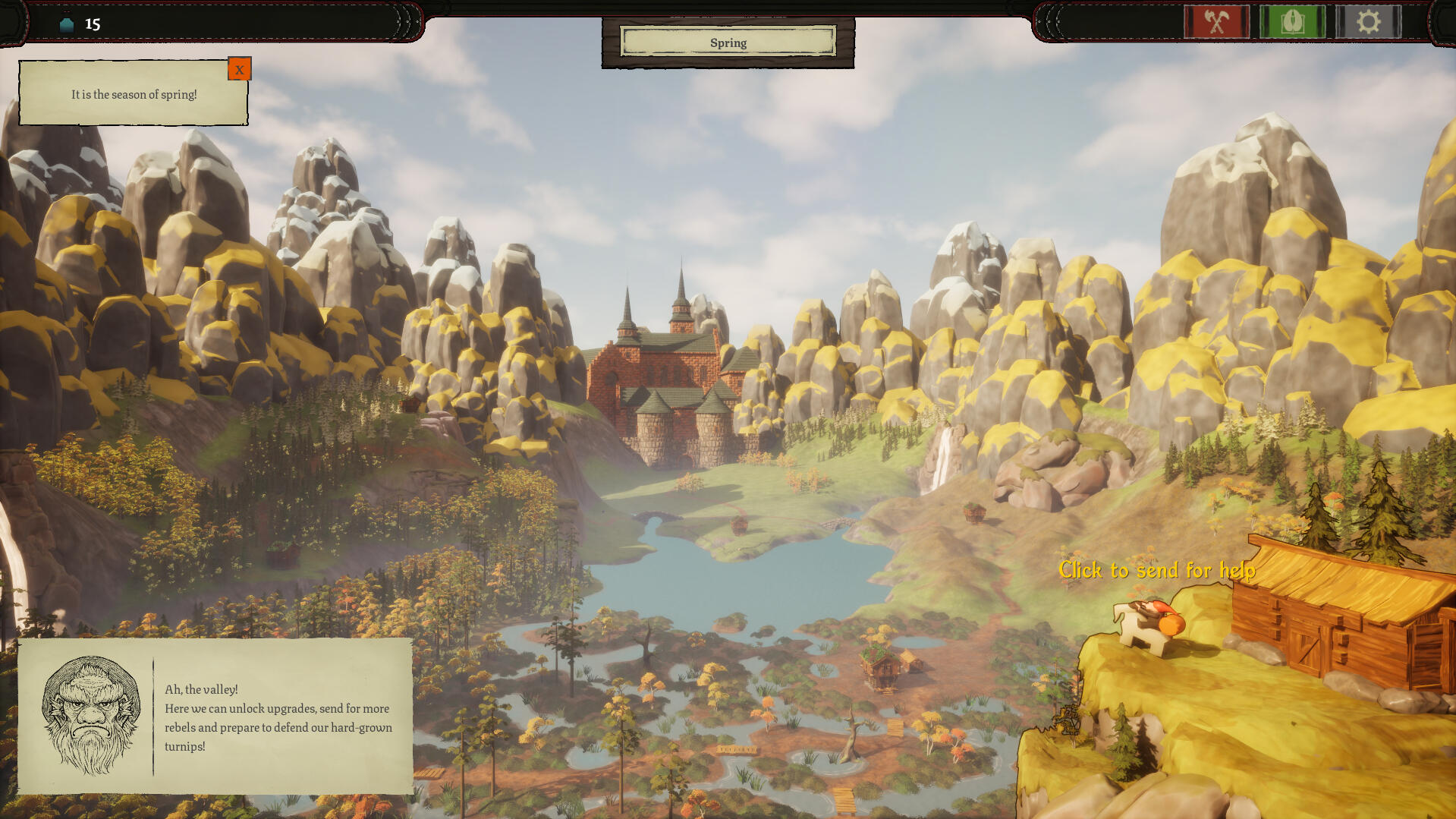
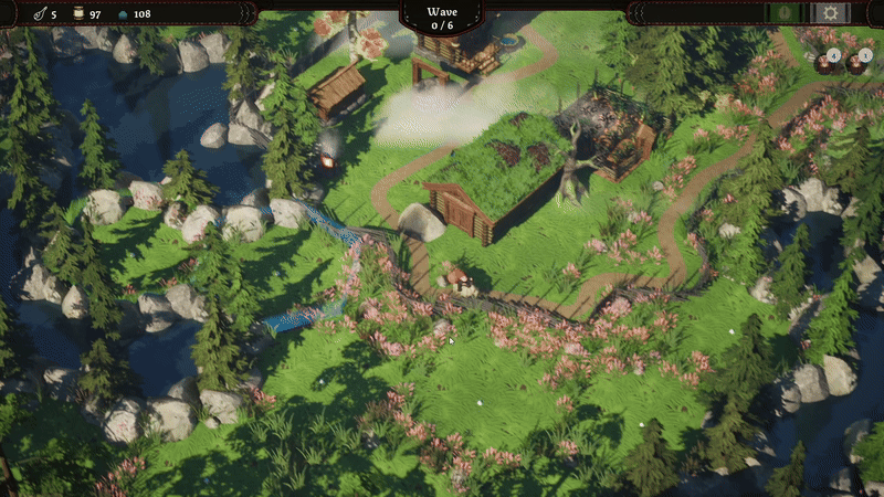
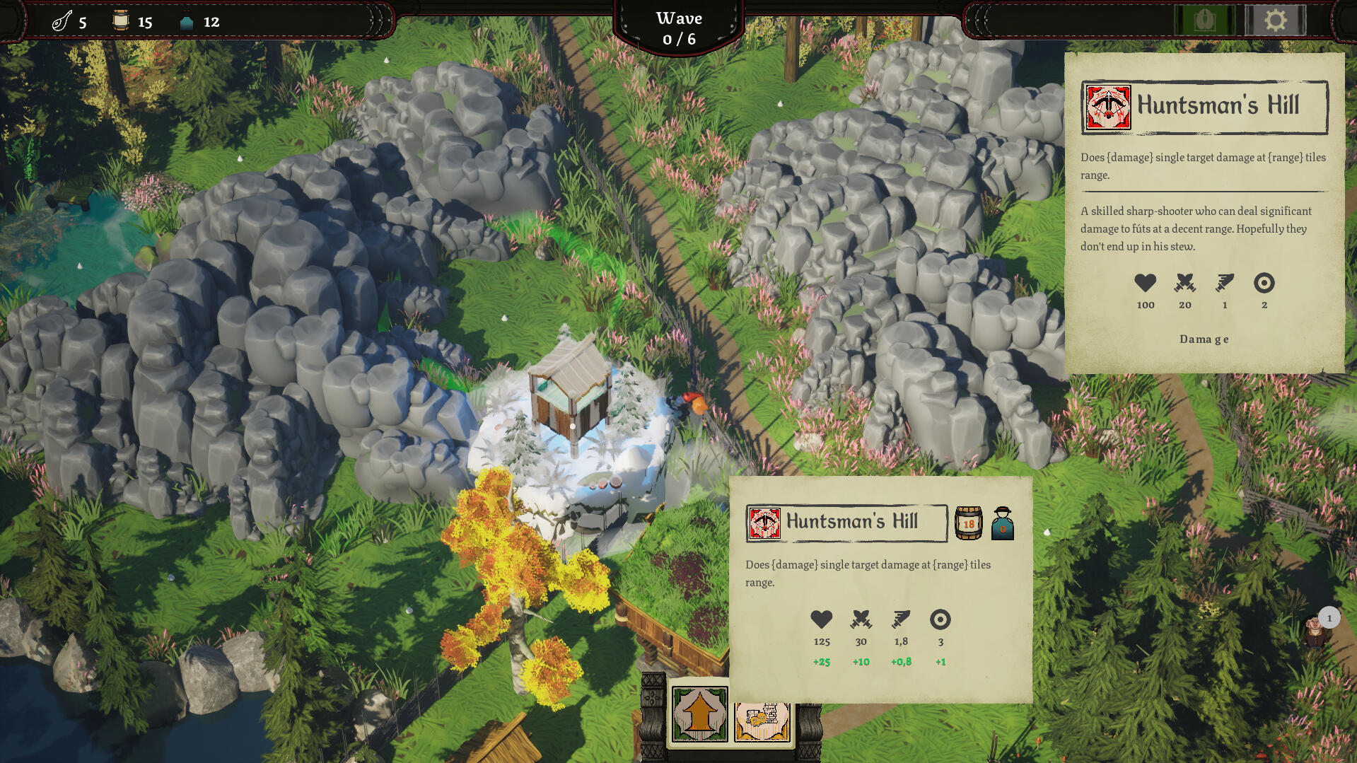
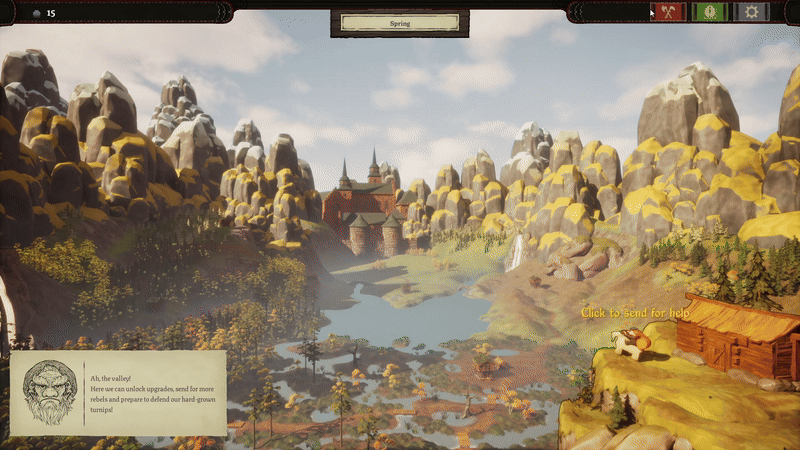
Not Yet Titled TD
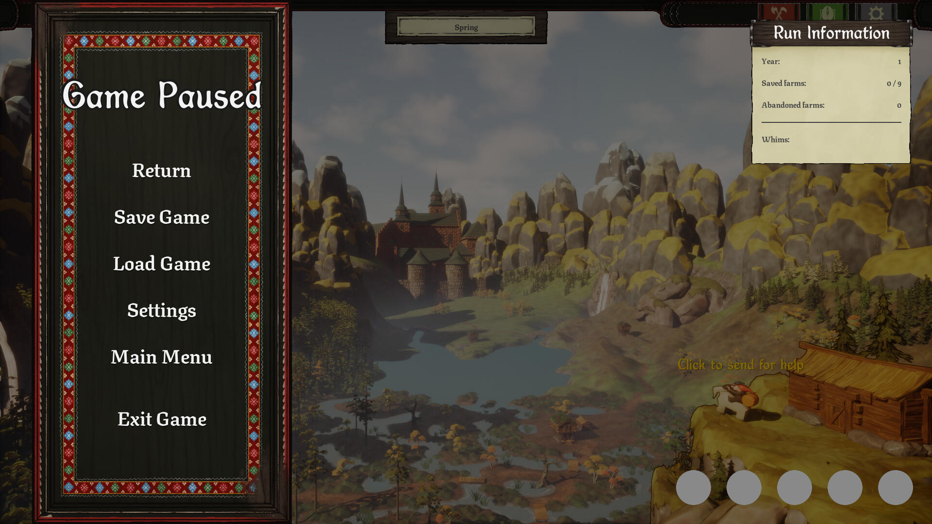
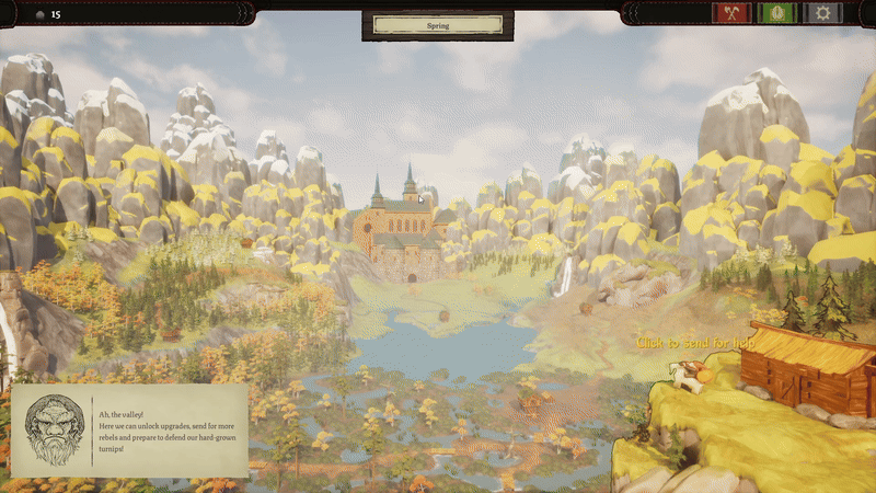
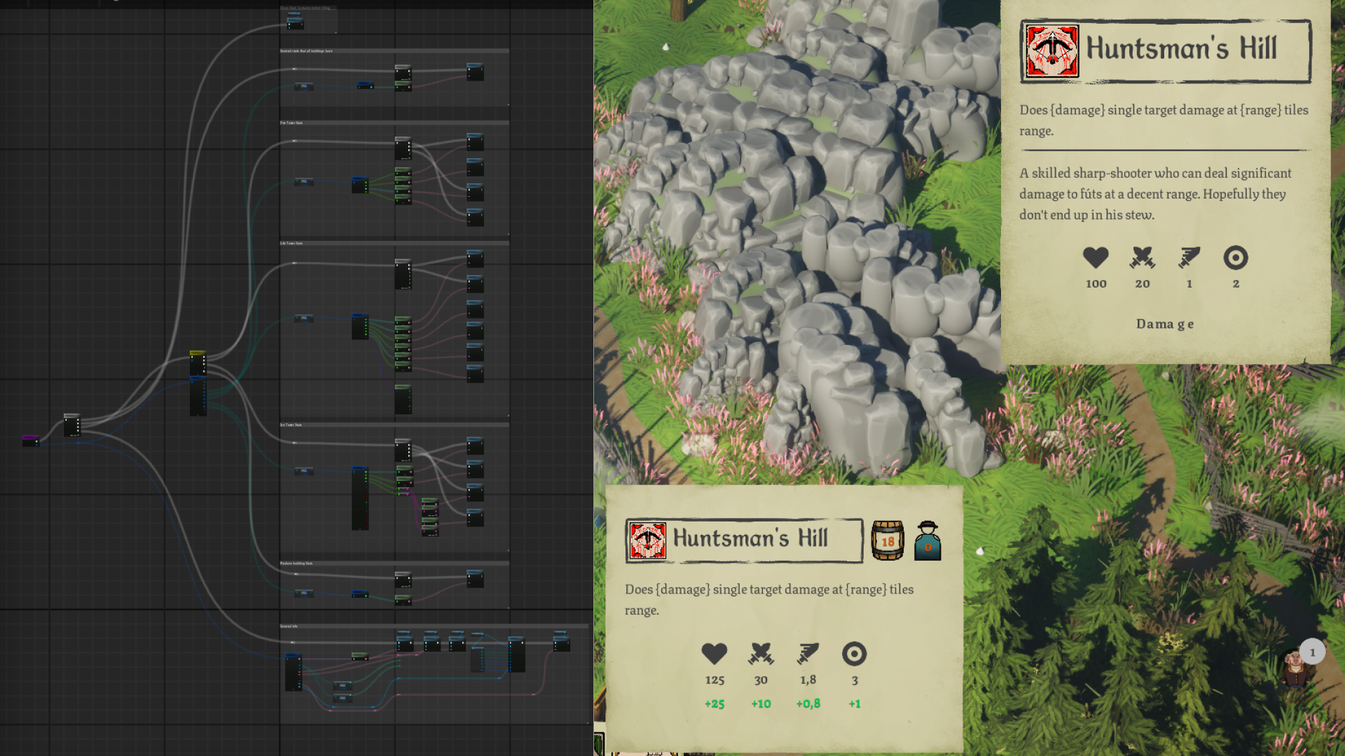
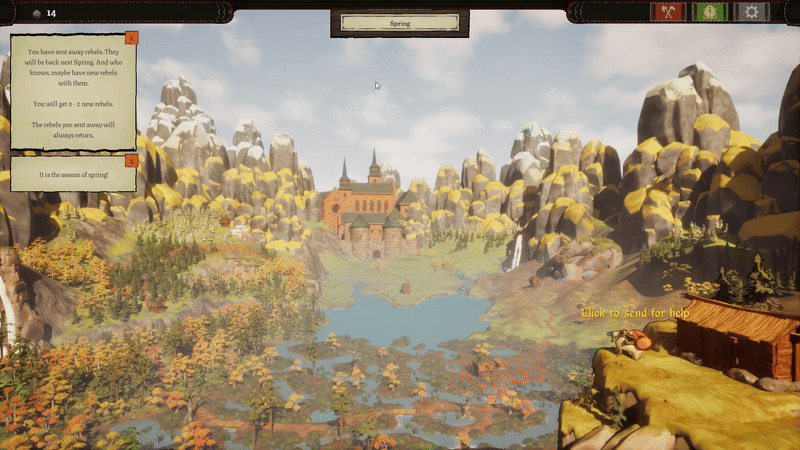
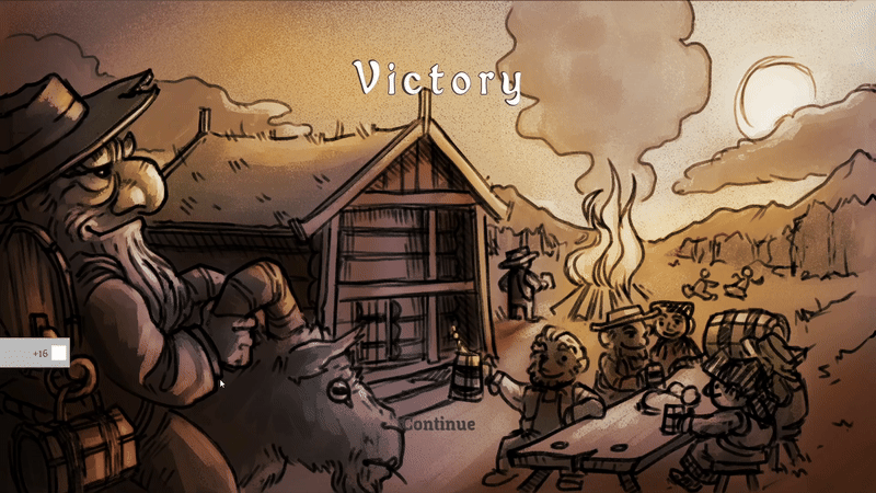
A rogue-lite tower defense game set in 17th century Scandinavia.In a forgotten valley that has dodged taxation for generations, the king has finally come to claim his tithe. It’s up to the farmers, or should we say rebels, to defend their land from the king’s relentless tax collectors using whatever tools they can find.One of the core pillars of the game is “satisfaction”, with a strong focus on making interactions extra nice.
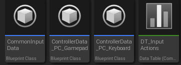
Common UI | Enumeration | Data Tables | Data Map | Dispatchers | Dynamic Setup | Scalable Setup | UI Animation | Material Animation | Prototyping | Research | Bug fixing
Time: 6 Months | Size: 8

School Projects

UX/UI Design | UI Programming
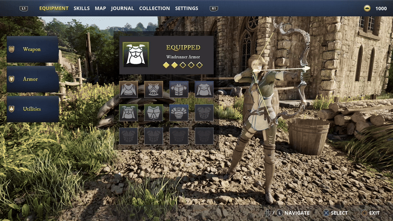
Project Raven
An cohesive open-world UI set in a medieval theme, with a focus on usability and readability.
The project's goal was create an user-friendly and cohesive UI.
Through research of biggest titles of the same genera and we made some interesting findings.
Enumeration | Data Assets | Interfaces | Base Widgets | Widget Switcher | UI Animation | Material Animation | Figma Prototyping | Research | Bug fixing
Time: 5 Weeks | Size: 2

Other Projects
This is a collection of a lot of small projects. Both in Unreal, Unity and strict Figma projects.

System Programming | UI Design | UI Programming
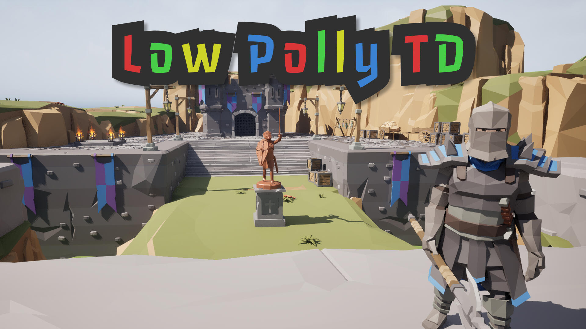
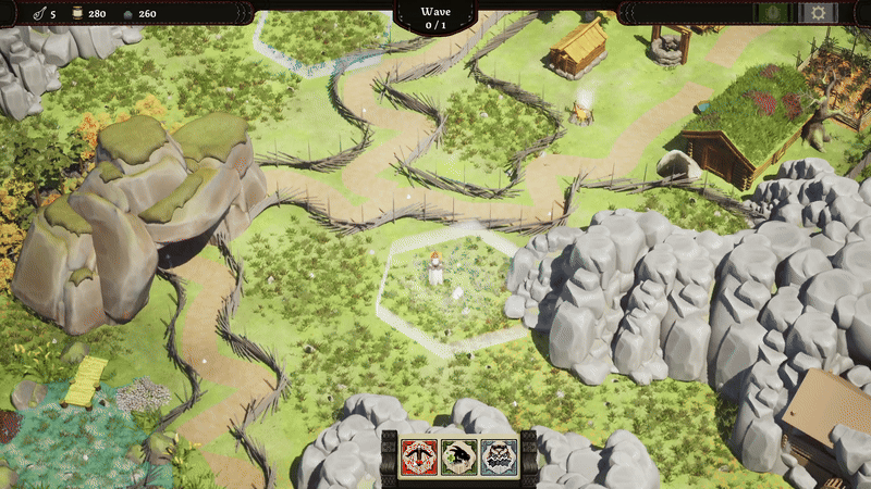
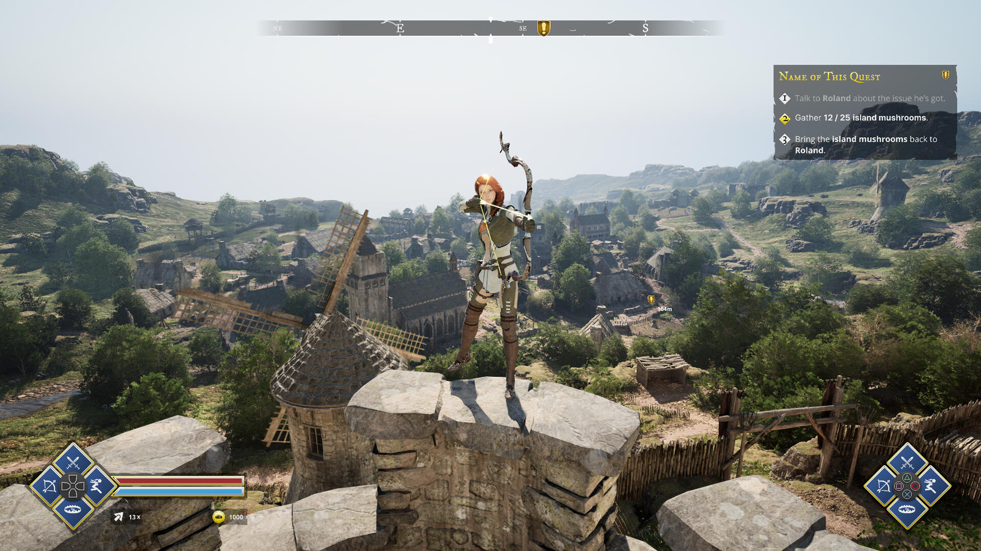
Low Polly TD
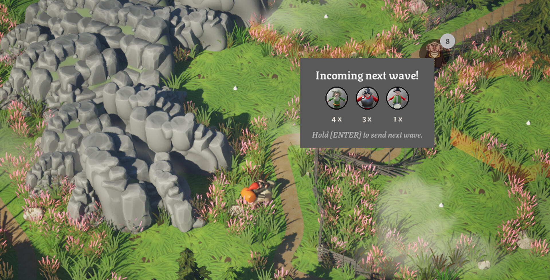
A hero-based, rogue-lite tower defense prototype where the player defends a castle against ever-growing waves of enemies.
The game is structured around two phases: Build Phase and Combat Phase. After each combat phase, the player chooses between upgrading towers or their hero. Then selecting one of three randomly presented upgrades of the decided choice.This project was created to challenge us in designing and coding gameplay and systems from the ground up.
UI | Wave Manager | Spawning Grid | Tower Placement | Targeting System | Projectiles | AI
Time: 5 Weeks | Size: 2

Not Yet Titled TD

OverView
Internship
I spent just under six months at Ancient Well Entertainment, where we developed a game from scratch. I completed my internship when we shipped the alpha.The development process was a bit different from the norm. The studio had three UX design interns, and we were grouped as a team to create the game’s UI together. Our goal was to deliver the UI at 80% polish for the alpha, so the groundwork would be ready when we left.
Research & Testing → Prototyping → Pre-Alpha → Dynamic Development → Alpha

My Work
During our time at the studio, we planned most of our work independently, guided by input from the director. We followed an agile workflow but also created a rough plan for the entire internship.My contributions:
UI Logic | Common UI setup | UI Animations | Material Animation | Market Research | Bug Fixing
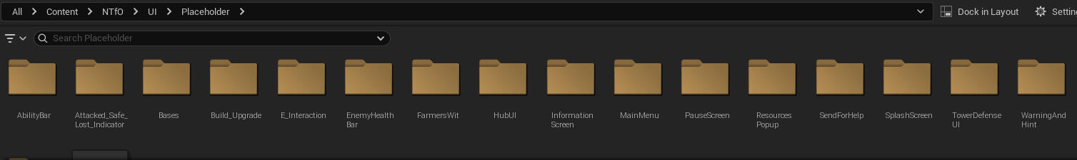
Placeholders
The game relied heavily on UI, so it was important to implement a large portion of it early. In the first part of my internship, I focused on quickly building hard-coded placeholder widgets to populate the game. This way playtesting could start as soon as possible.
Common UI
Direction
Early in development, we decided to research Common UI. After going through documentation and watching several YouTube videos, I advocated for transitioning to Common UI, since we were going to remake our widgets from placeholders → final versions anyway.
Setup
We chose Common UI over the engine’s default UI system because it offers more features, such as an optimized multi-input system, styling support, built-in animations, and more. While the initial setup can feel daunting, it becomes fairly straightforward once you understand how it works.
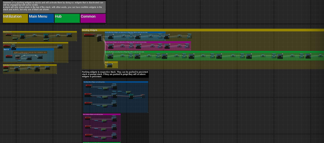
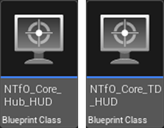
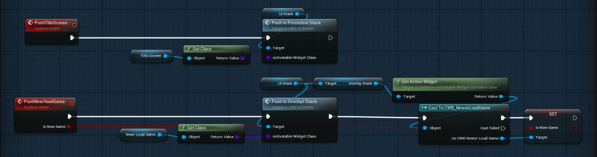
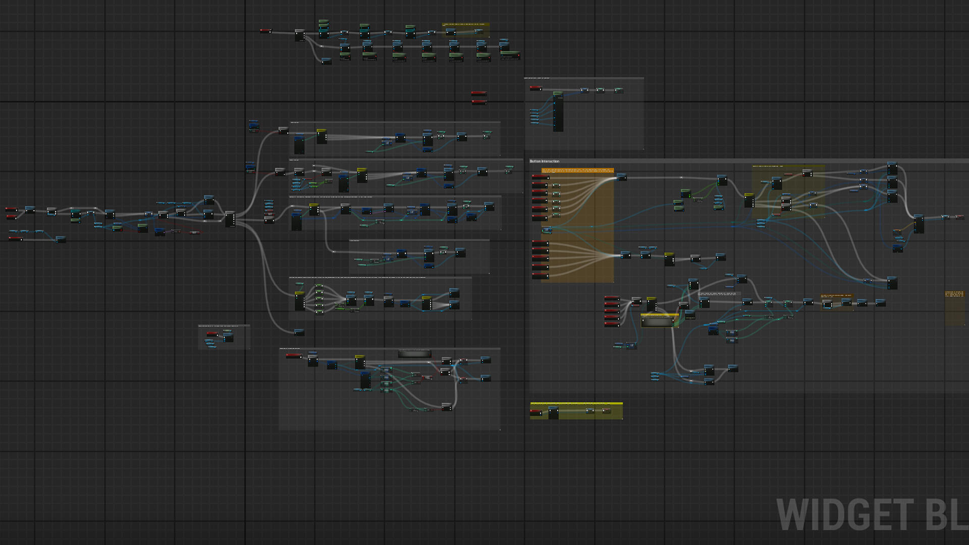
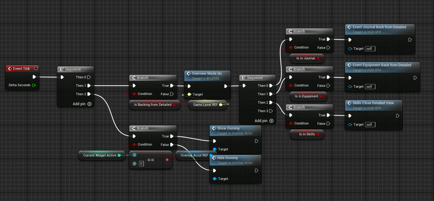
In this game, we used two HUD Blueprints, one for the hub area and one for the tower defense gameplay. Each HUD managed the UI through a reference to a single “base widget,” which contained the only active canvas. All widgets were added using the push function.To minimize dependencies, I kept logic self-contained within each widget, though in some cases they did interact and share functionality.
Styles
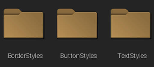
One of the most useful features in Common UI is the ability to use Styles, which function much like styles in standard design tools. They significantly speed up development.
It also makes updates and reworks much easier and more efficient.
Input System
Although we didn’t use multiple input sources during development, I enabled support for them so the designer could implement them later without the hassle of additional setup.
Pushing Widgets
I created a function to handle pushing widgets to the stack, ensuring it only pushed if the same widget wasn’t already on top.
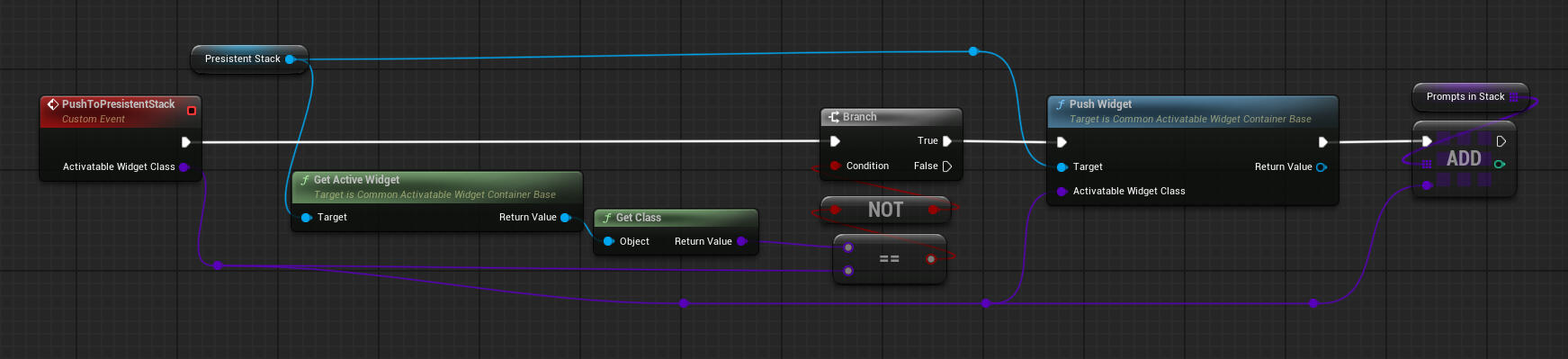
The HUD determined which widget to push, and in some cases, I needed to set specific variables when a widget was pushed.
Reflection
I’m really happy we chose Common UI as our framework. It offers many advanced features, and everything just works smoothly. I believe Common UI is the future of Unreal UI development, and I look forward to using it again whenever I get the chance.
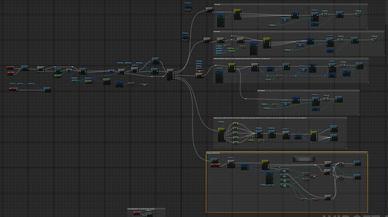
Farmers Wit Panel (Upgrades)
Direction
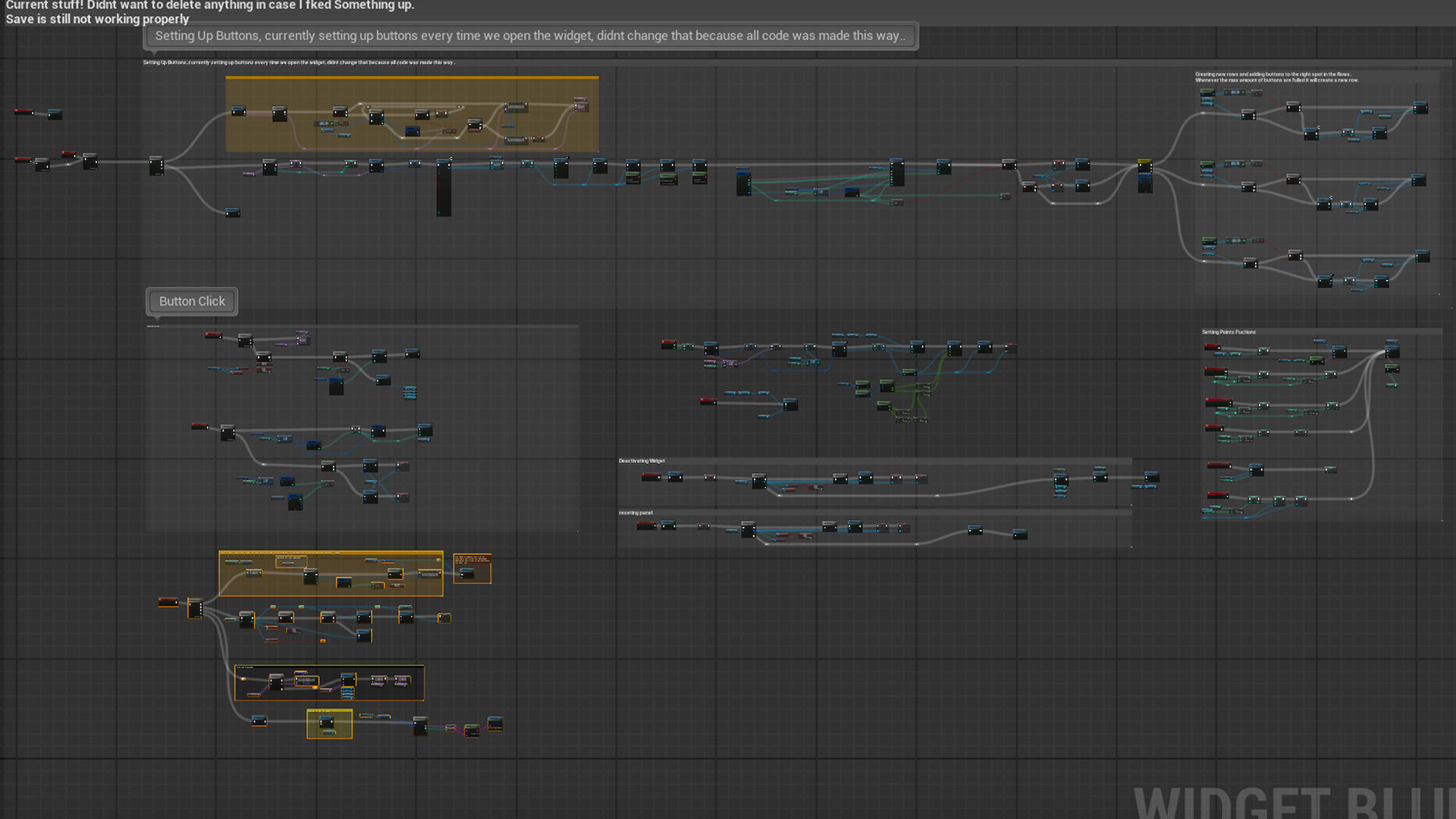
The Farmer’s Wit Panel went through many development iterations. The final direction was to make it scalable and dynamic, allowing the other designer to easily add items by only updating the data table.
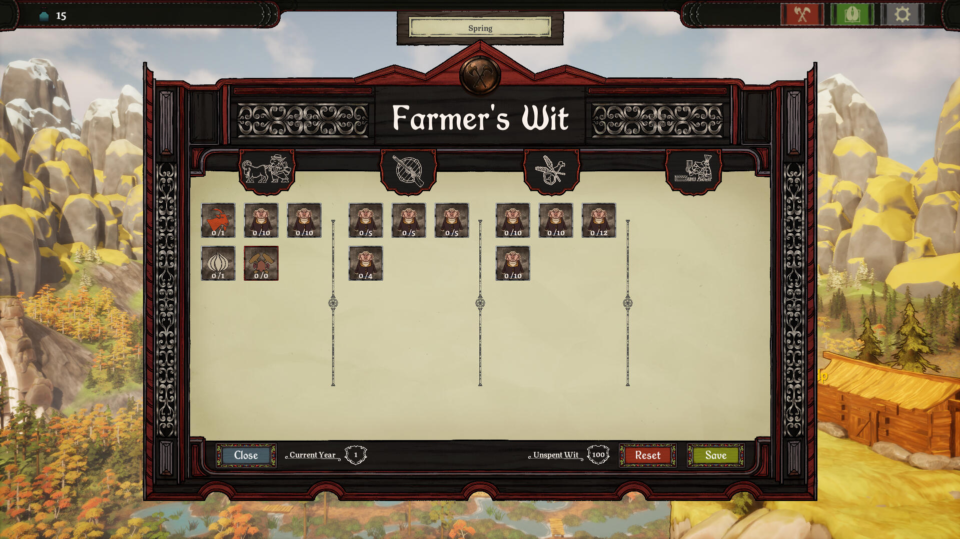
Button Creation
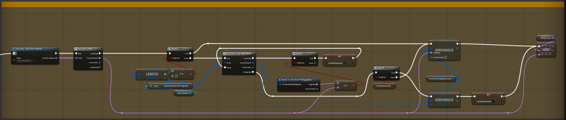
When the panel opens, it gathers all rows from the Farmer’s Wit data table into a local array. It then checks which upgrades are unlocked and their ranks, storing this information in a separate struct array.
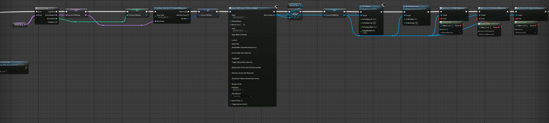
Next, it creates a button for each upgrade, setting properties like size and connecting event dispatchers for dynamic behavior such as hover and click events.
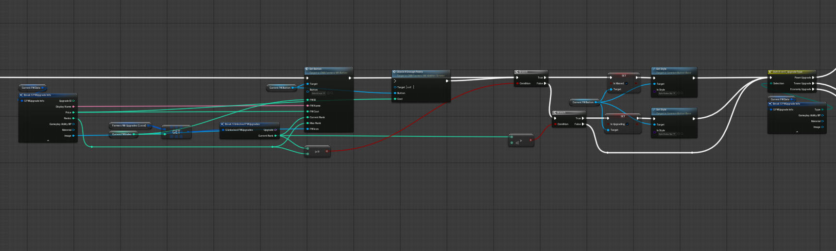
Each button is assigned a unique ID and all necessary variables - such as cost, rank, and other related data - are set at this stage.
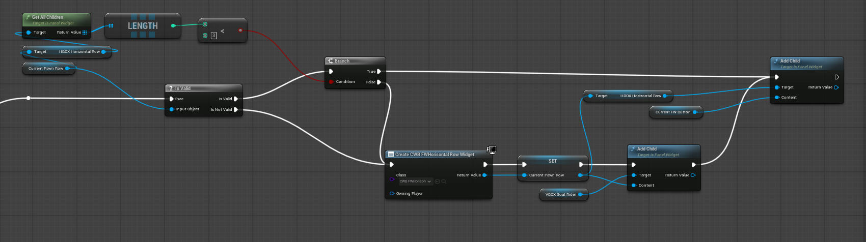
Finally, the system sorts buttons into the correct column based on their type. New rows in the panel are created automatically whenever a row becomes full.
Dynamic Hovering & Clicking
Hovering and clicking is set up so that dispatchers trigger the same events.
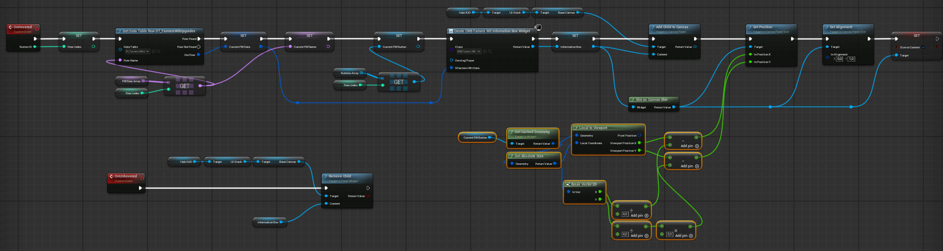
The way the panel knows which function to trigger, the dispatcher sends its ID through and the variable "Current Row" is set.
Then it creates a widget that displays information about the upgrade coming from the data table row that is set in the variable.
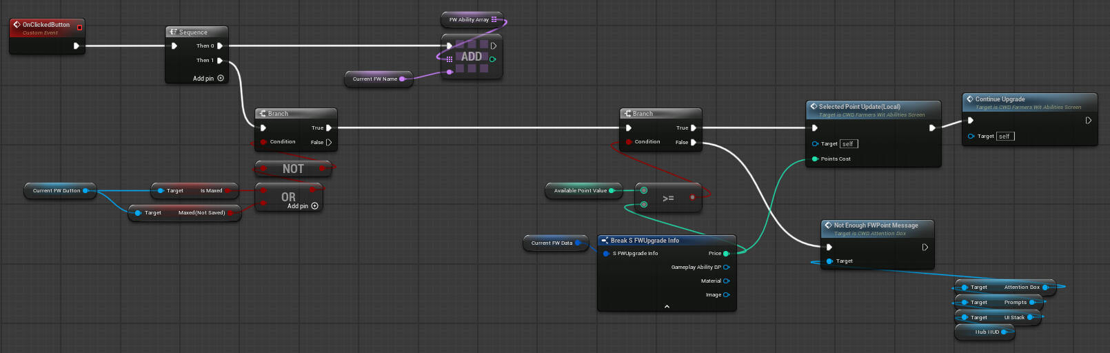
When clicking a button it checks if you have enough points to upgrade, and if not you get a fail message.
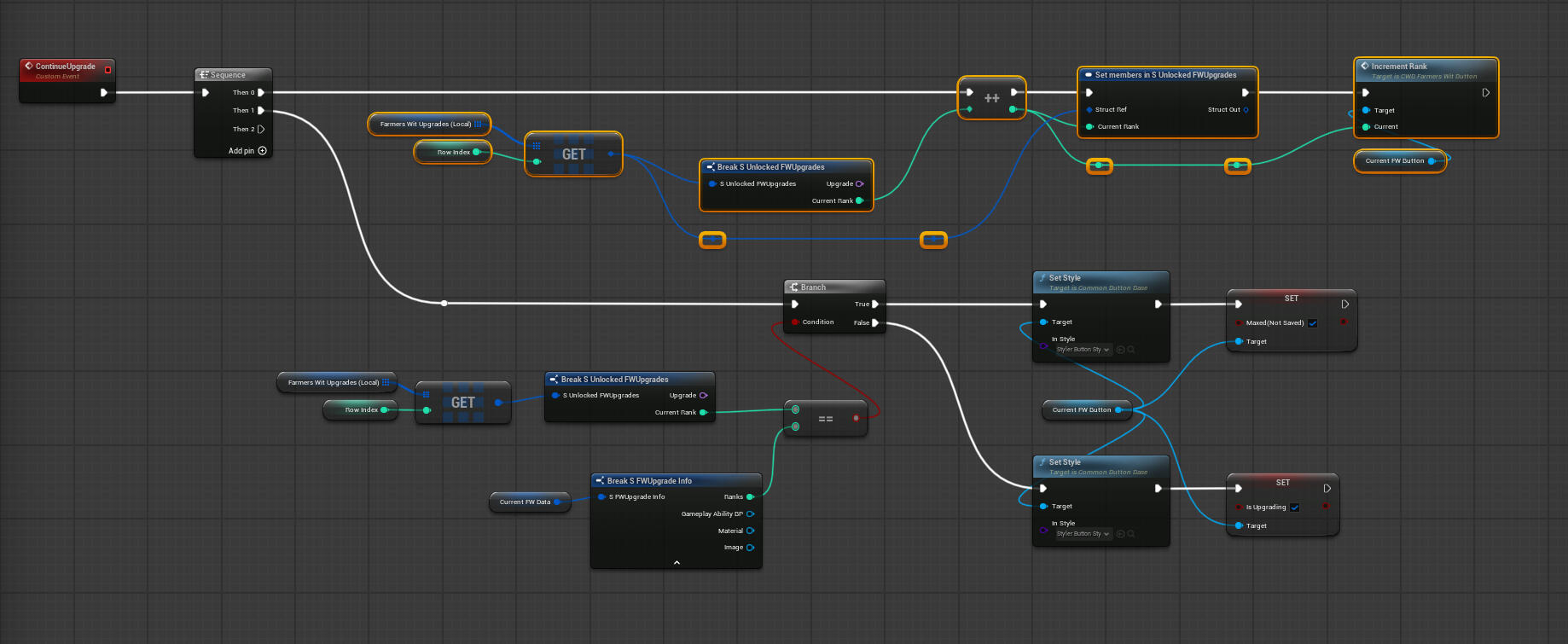
Finally it set the rank, style and current farmers wit points.
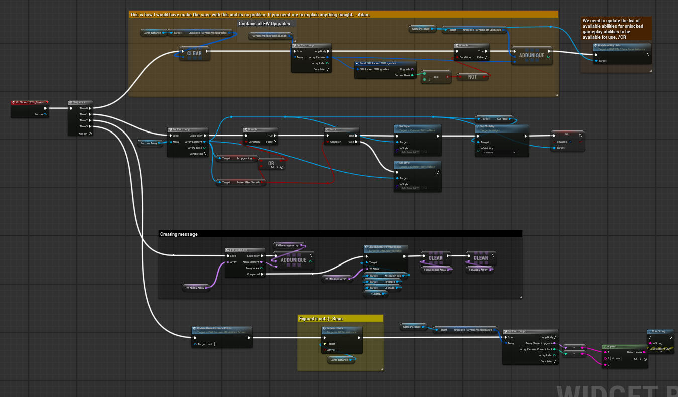
Saving
When pressing "save" the unlocked upgrades are added or adjusted to the current rank in the "game instance upgrades array".
It changes style to owned ability and created a message.
Reflection
Creating this widget was a great challenge to overcome. Lots of debugging, trial and error and some directional help I managed and feel conferrable to make dynamically built up UI systems. I also learned a lot about dispatchers and how powerful it is to push variables through them.
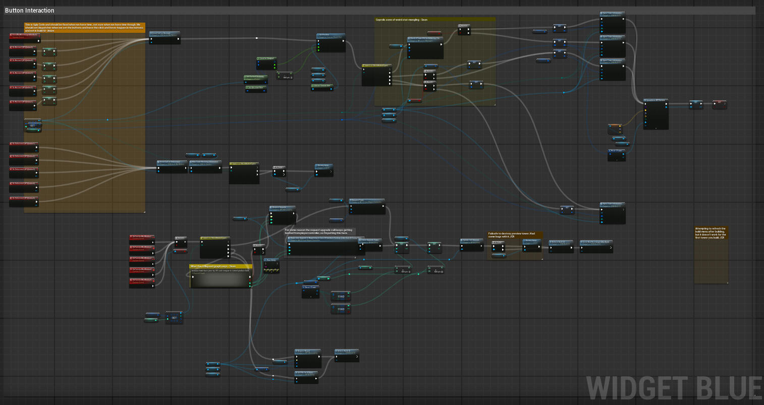
Tower Construction UI
Direction
This UI was designed to handle all aspects of tower construction and upgrading.
It dynamically resizes based on the number of available actions-buttons at any given time.
It also includes hover tooltips and UI that displays information about the tower placed on the selected hexagon.
Research
This was the first panel I worked on with a truly dynamic setup, so there were several things I had to learn in order to meet the design goals.
It was a valuable experience that helped me better understand scalable UI design and adaptive layouts.
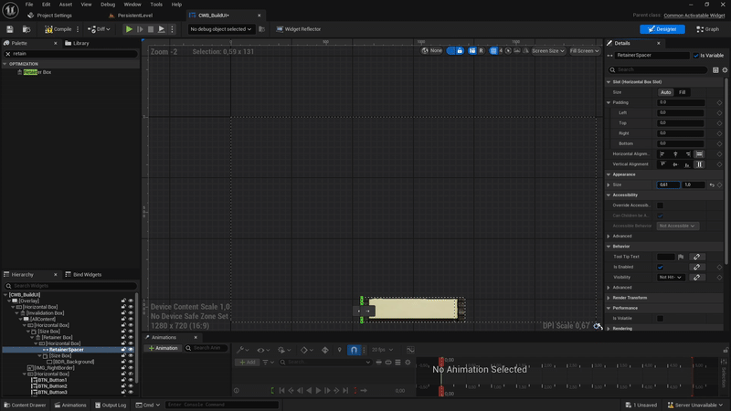
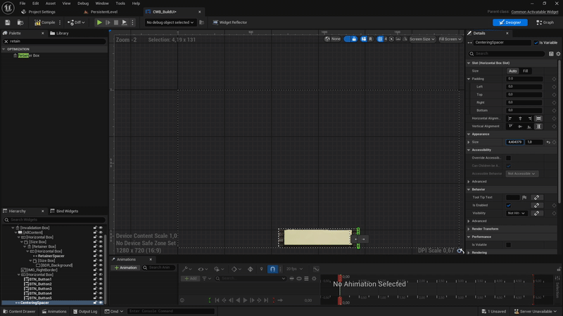
Masking & scaling UI - To manage masking and dynamic scaling, I used Unreal’s Retainer Box to limit visible content, and a Spacer to push elements based on how wide the UI needed to be. This allowed the panel to resize cleanly depending on how many buttons were visible.
Data driven UI - I also learned to use data tables to build the UI dynamically. This made it easier to handle different tower types and upgrade options while keeping the setup flexible and easy to update.
Masking and Scaling
The UI shifts all content inside the Retainer Box to the side based on how many action-buttons are currently active. A counter spacer is also used to keep the UI centered on the screen.All of this is set up dynamically when the UI is activated.
Dynamic Setup
When the panel is activated, it checks which hexagon on the grid it was triggered from and whether there's a tower placed on it. Based on that, it sets up the appropriate buttons and are setting a struct that holds the data connected to those buttons.
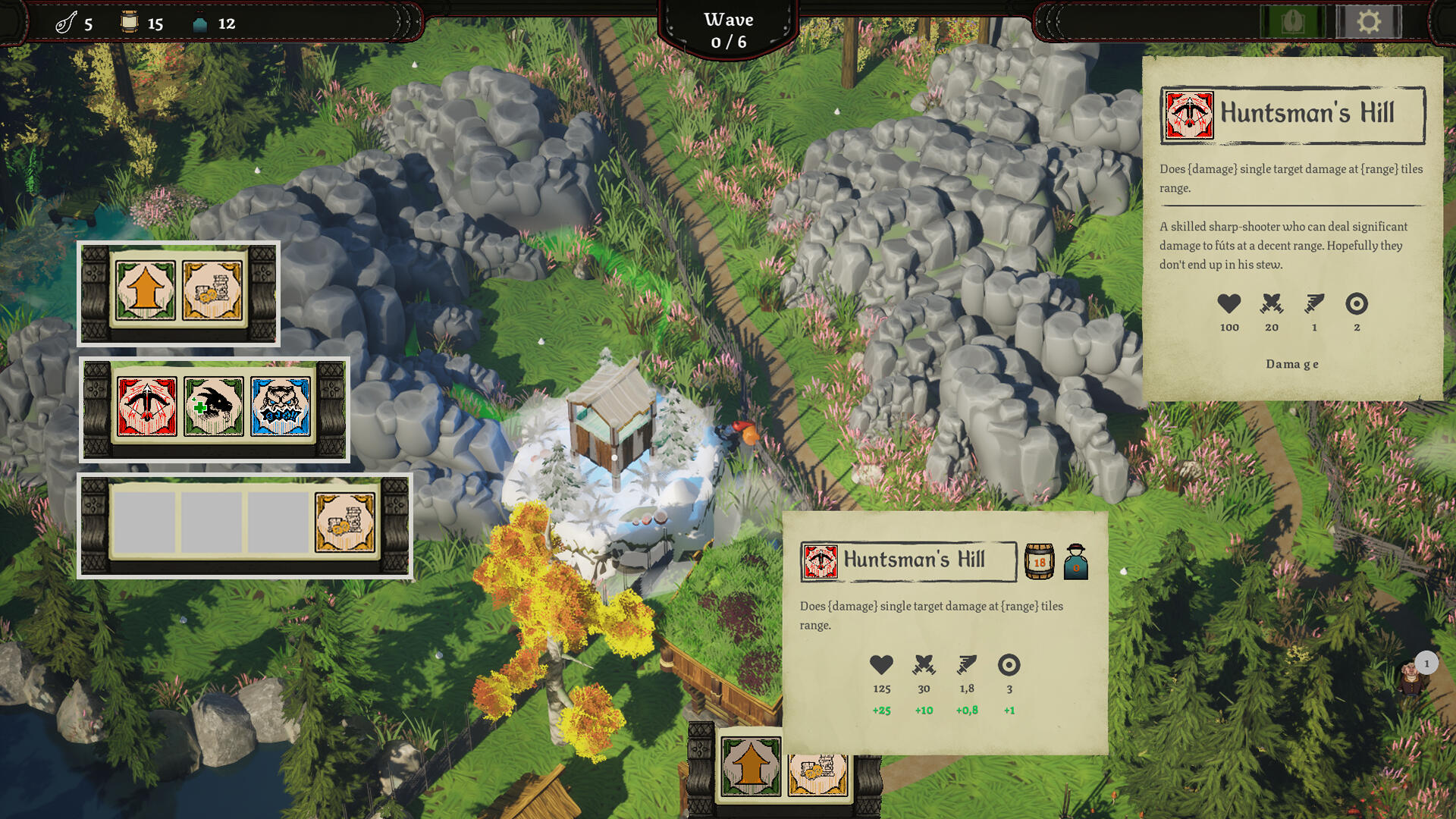
Hovering and Clicking
When the player hovers over a button, a variable is set to indicate which tower they want to build or upgrade. The system then checks the tower’s cost and whether the player has enough Rebels and Produce to afford it.If the player holds the button, an animation begins. Once the animation finishes, the selected tower is either built or upgraded, depending on the context.

Information Panels
Both the hover info panel and the current tower panel use similar functions to populate their content. When the panel is activated, the current tower data is passed through an event, which sets all relevant text and images for both panels.A switch is used to determine which set of functions to call, depending on whether type of tower is build or upgraded.
Reflection
This was my first real dynamic UI setup, and I received valuable help from the lead programmer who built the initial foundation. His guidance gave me the confidence to take over and expand the system. Through this process, I learned a lot about best practices for dynamic setups and how to structure flexible, scalable UI elements. Collaborating with him not only improved my technical skills but also showed me the importance of teamwork and learning from more experienced developers.
Enemy Spawn Indicator
Overview
This widget shows where enemies are coming from and how many of each type. Each spawn position gets its own indicator, which snaps to the edge of the screen if it's outside the viewport, keeping the widget visible at all times.
Creation
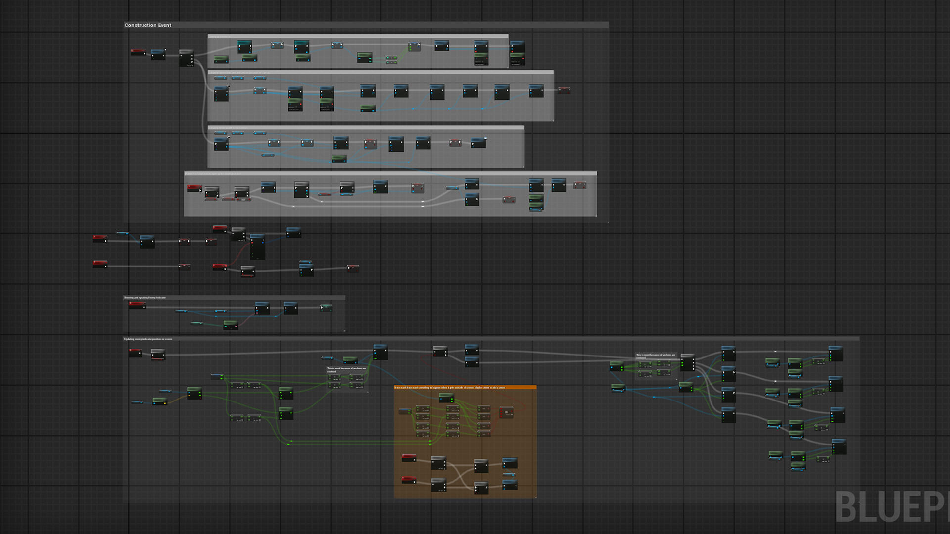
When the grid is created, the Wave Manager collects the position of every spawn point in the level and spawns an enemy indicator at each location.
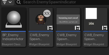
Each Enemy Spawn Indicator creates a widget and adds it to the base canvas. If the player clicks an indicator, it opens a secondary widget, which then spawns widgets that show what and how many of each type that will be spawned.
Positioning
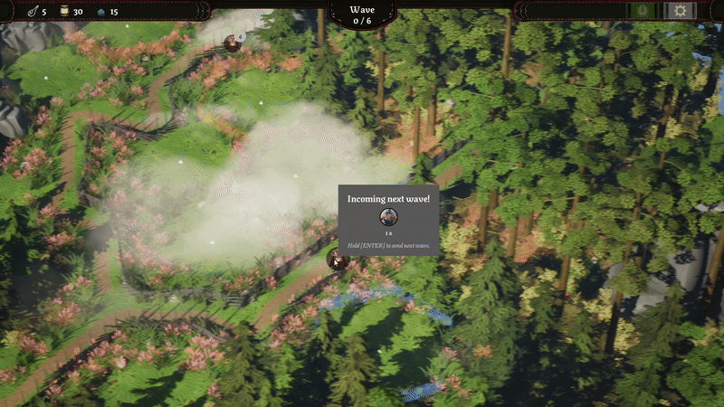
The widget updates its position every tick to ensure smooth movement as the camera or viewport changes. This keeps the indicator aligned with its spawn point in real time.
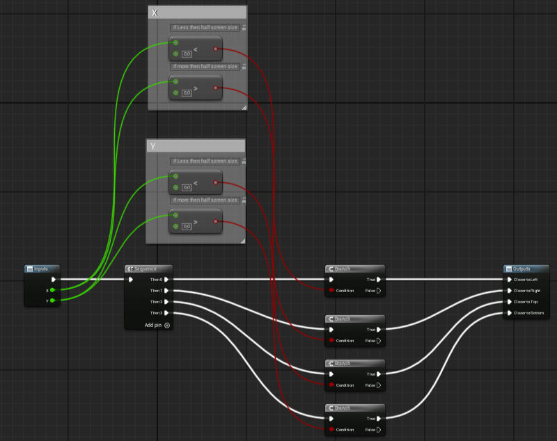
The widget dynamically changes the pivot point of its information panel based on its position on the viewport. This ensures that, when the indicator is snapped to the screen edge, the panel always opens inward and never clips off-screen.
Reflection
The hardest part of this system was getting the positioning to work correctly across different aspect ratios. It took a lot of fine-tuning to make the indicators follow their spawn positions accurately in all screen setups.I also spent time testing and tweaking the animations to make sure they felt responsive and polished. Getting the right feel was just as important as getting the logic right.
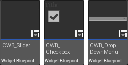
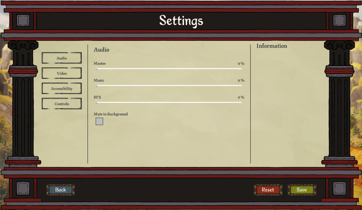
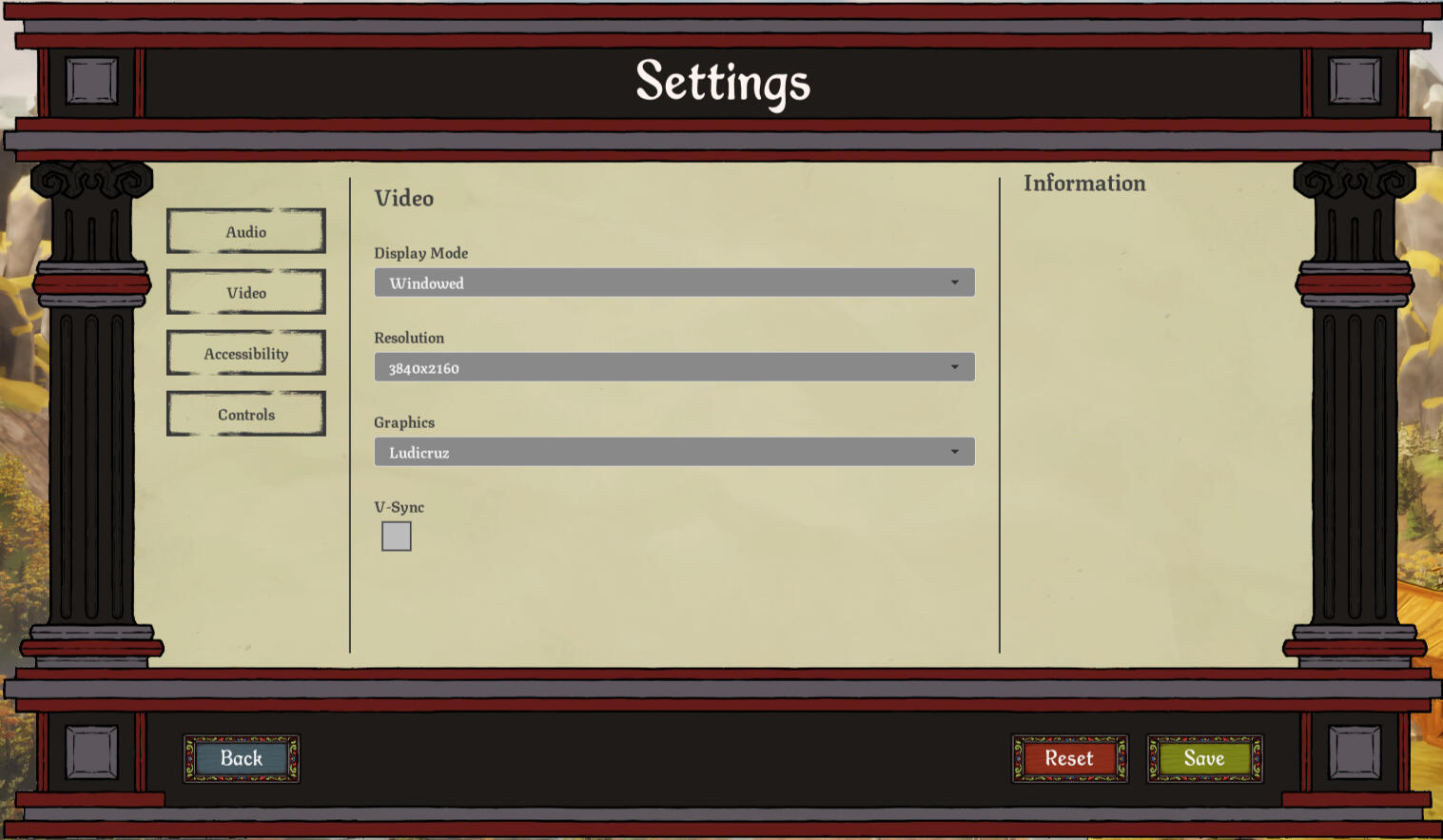
Settings
When I left Ancient Well, there was no existing logic for the settings menu. To make things easier for the developers going forward, I created a set of base widgets that could be reused and extended as needed.Each widget includes dispatchers that send out its current value, making it easy to hook into gameplay or system logic later. Additionally, every widget is set up to stream its own information to the settings panel’s info box, providing clear and consistent feedback to the player.
The base widget I created was:
Drop Down Menu | Slider | Check Box
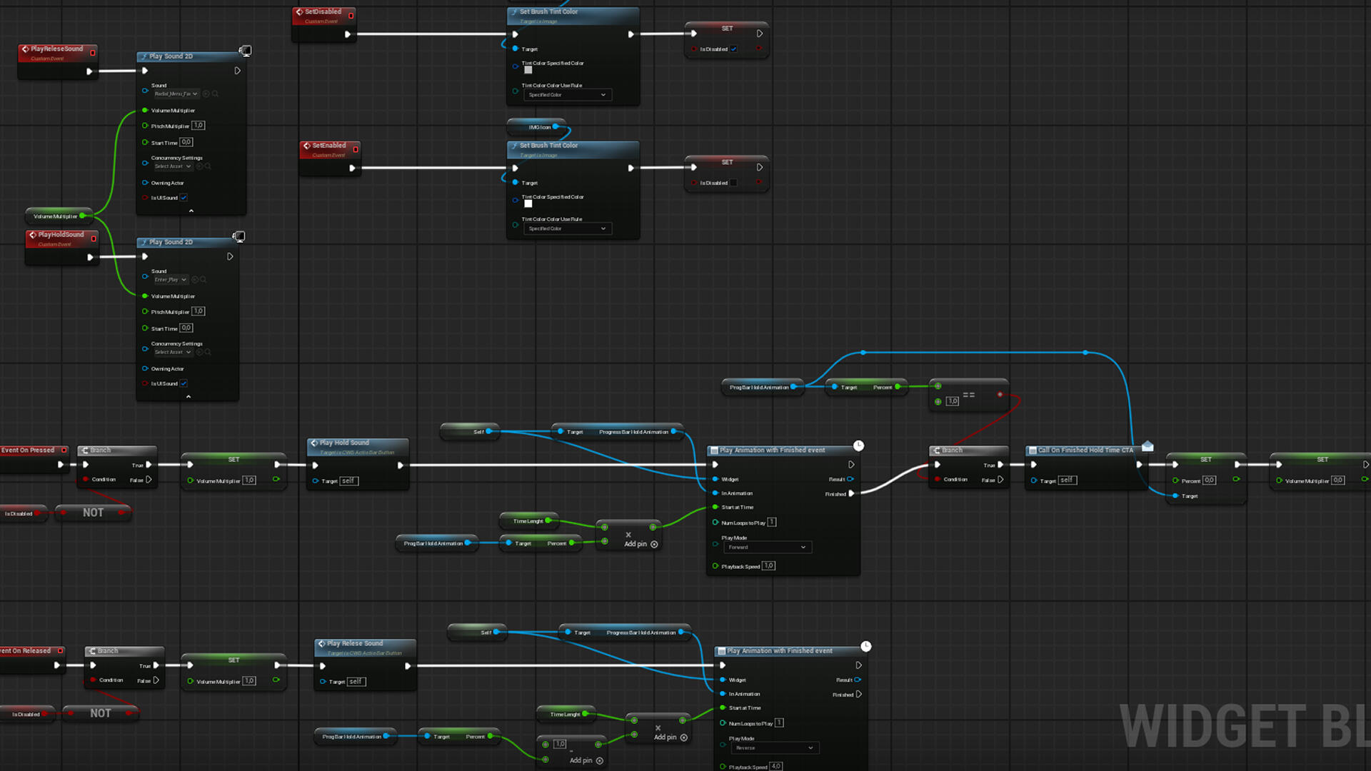
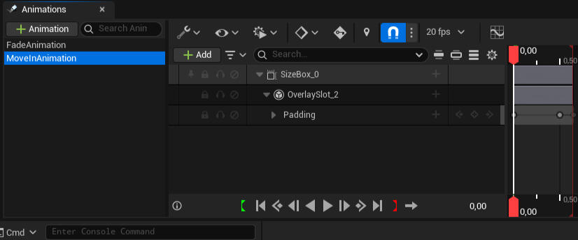
Animations
Overview
In this project I animated UI in three different way.
Regular UI animations
Material Animation
Common UI Animations
Regular UI Animations
I used the regular animation system the most for this project. For our project it was both because of knowledge and that our game was more graphic heavy then it was logic heavy.I animated in multiple different ways, fading, moving, scaling and combinations of these.
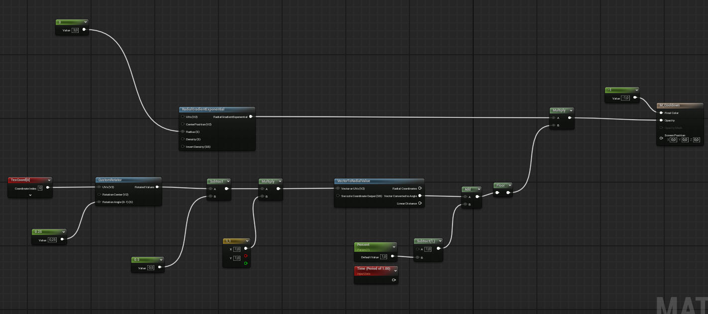
Material Animations
This animation was used on Conditions, Ability hotbar and hold animation.
To be honest.. I don't fully understand how this works but it is masking an angle of a circle.
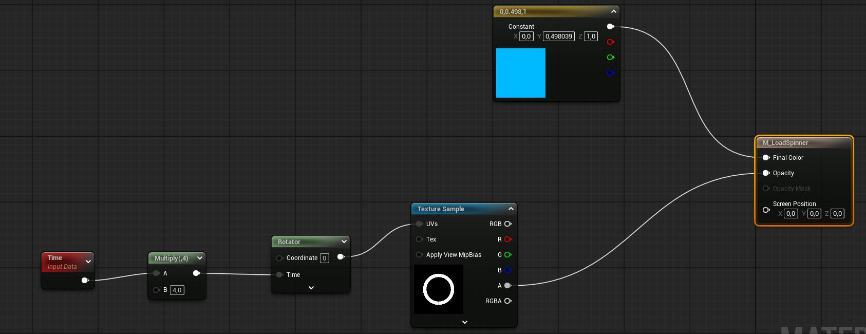
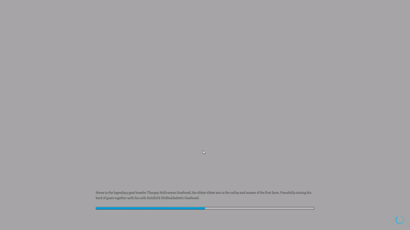
This was only used to make the player see that something is moving in loading screen.Using a rotator and time to have it always be moving.
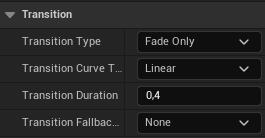
Common UI Animations
The Common UI plugin comes with built in transition animations. that can be edited from the details view if you use the "Common activatable widget stack".
Reflection
I'm really enjoying working with animations , there's so much to explore, and I feel like I'm just scratching the surface .I've also learned that creating animations that feel right takes more time and iteration than I expected, but it's incredibly rewarding when it all comes together.
Take Aways
During my time at Ancient Well Entertainment, I learned so much, and I’m truly grateful for the way they supported us throughout the internship. They gave us the space to explore, experiment, and grow. thanks to that, they took us from being student to junior developers.A special thanks to Chris for being an incredible director and mentor. His guidance made a big difference.With that said, here are my key takeaways from this project:
Personal growth - I’ve grown into a much stronger team player. I'm naturally very results-driven, but during this project, I had to adapt my approach to better support the whole team. It was a valuable experience in learning how to collaborate with people who think and work differently from me.
Developed immensely in my craft - I’ve learned a tremendous amount about Unreal Engine and the tools it offers. Working with data tables, dispatchers, enumerations, data maps, and a wide range of nodes. My confidence and efficiency in using Unreal's systems have grown significantly.
Planning - Even with light planning, we kept our work on track. This helped me understand the importance of being proactive and sticking to a timeline. A little structure goes a long way.
Very humbling - To be honest, I overestimated my skill level at the start of the project. This experience taught me to be more realistic and humble about where I am, and that’s been a good thing. It’s made me more open to feedback and more motivated to keep improving.
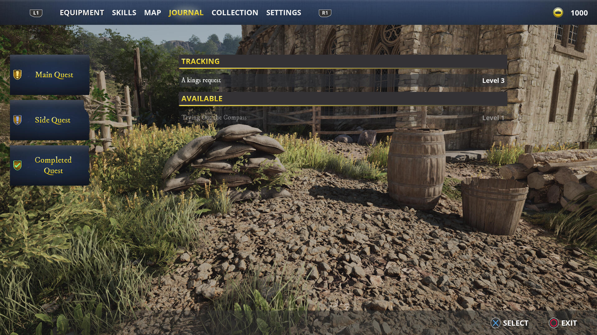
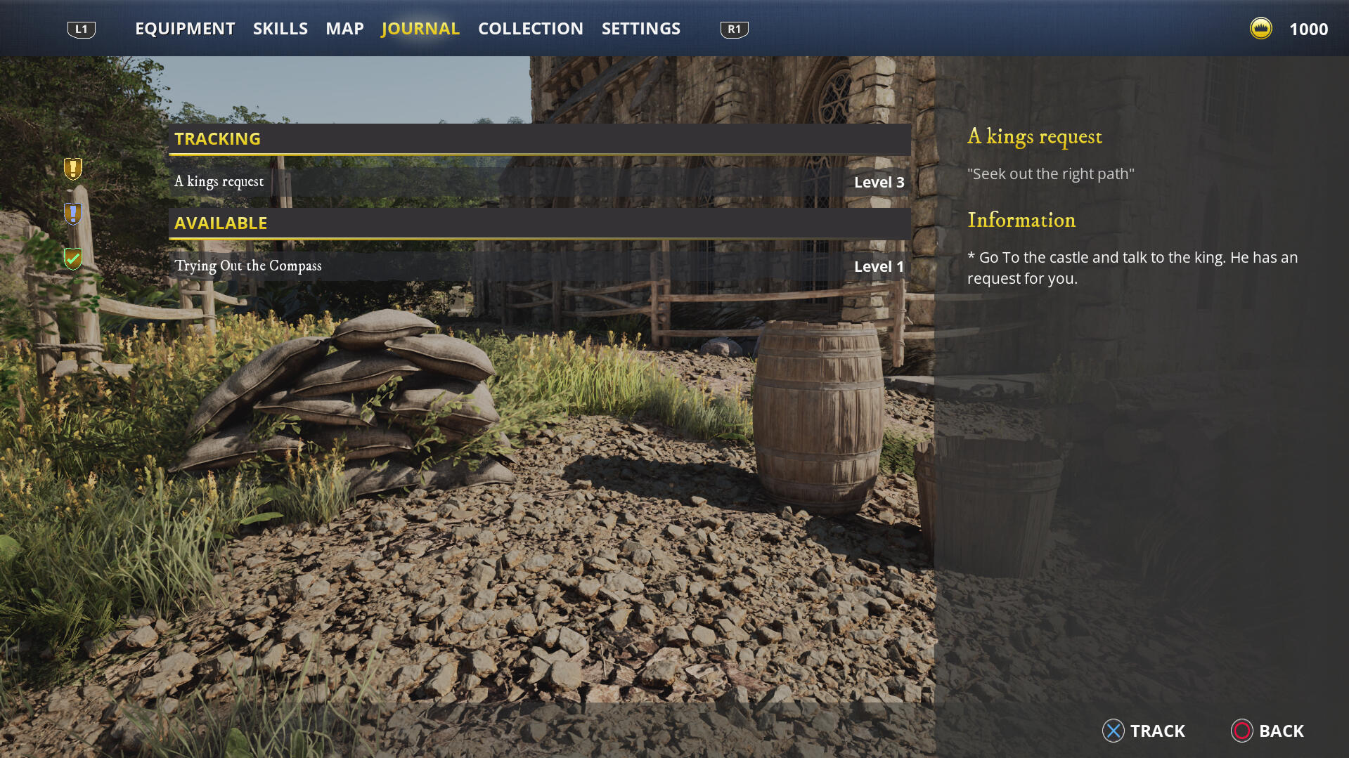
Project Raven

OverView
Goal
This project was part of a course at Futuregames, where we were assigned to identify common UI challenges in modern games and improve them from a UX perspective.
My Work
We conducted one week of research and four weeks of production.
We agile methodology to reach our goals.My contributions:
All UI art | Base layout | Journal screen | Map screen | HUD | Compass | Code for mentioned elements.
Discovery
Desktop Research
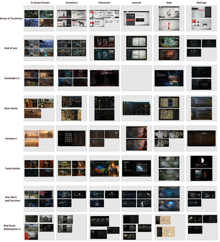
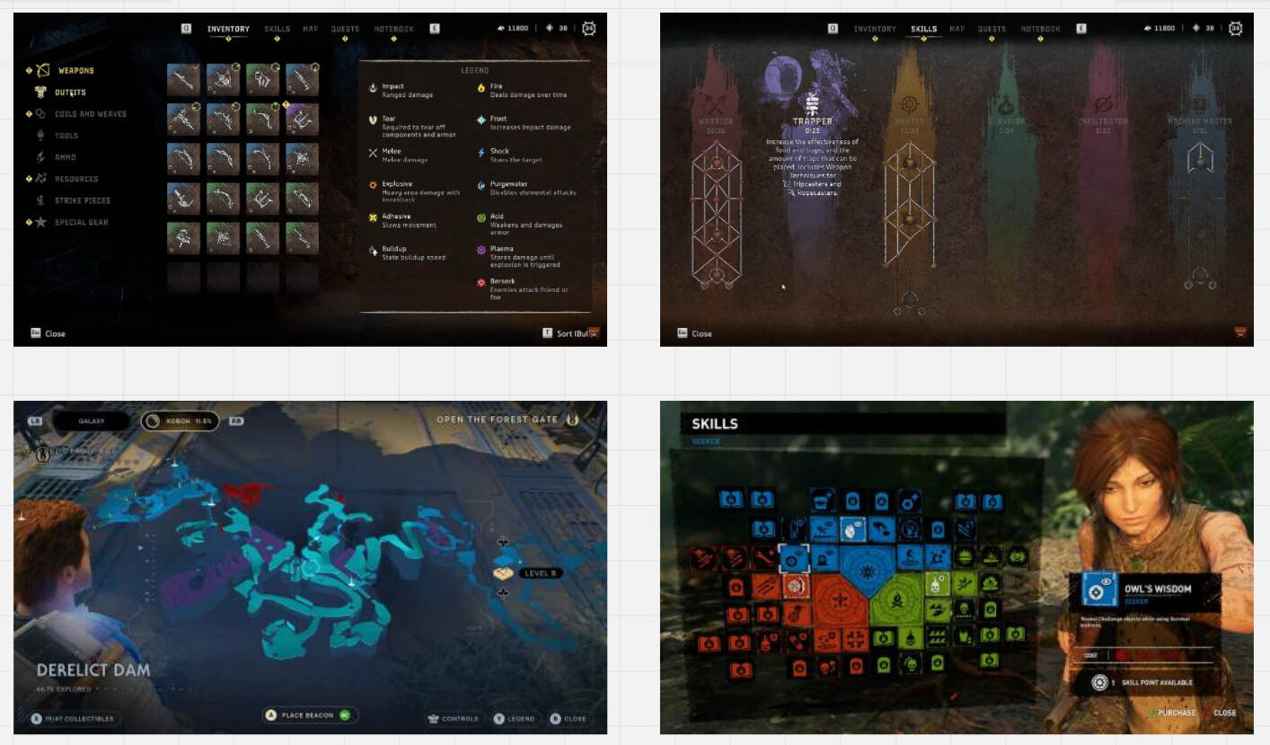
We conducted a deep dive, researching eight different titles. This gave us insights into many effective elements in the genre, as well as areas we felt could be improved.
Findings
For Improvement
Some games over-stylize their UI at the expanse of usability. For instance, Star Wars Jedi: Survivor has a hard-to-read map, Horizon uses unclear icons, and both Horizon and Tomb Raider have complex skill trees.
While these UIs are visually striking and memorable, they could be clearer.
Inspiration
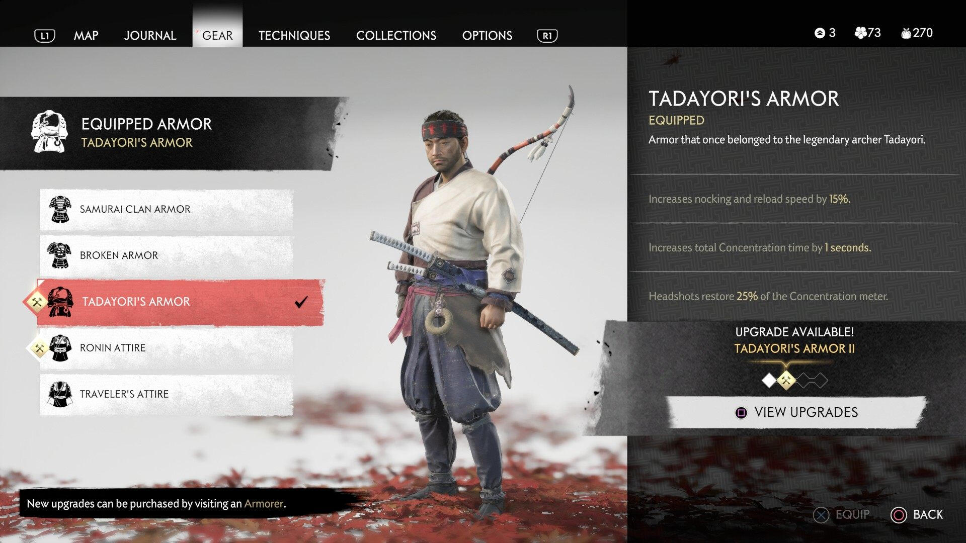
Ghost of Tsushima was a major influence on this UI layout. The game includes many impressive elements that are a real treat for UX designers.
This is the game that we research that we believed had the best useability and readability.
Though even it has some areas for improvement. For example, the inventory system that would benefit with a grid system like Horizon uses.
Development
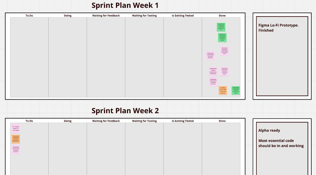
Agile Methodology
Another key component of this course was working within an agile workflow. We structured weekly sprints, each with distinct milestones: Alpha, Beta, and Final Product.
We also made an priority list in case we needed to adjust the scope.Green are priority.
Stages of Design
First Draft - We tried out different layouts, positions and the feel of the screen space
Low-fidelity - Tested readability and made Figma prototypes of the user flow.
High-fidelity - Getting a better understanding of the usability and readability with fully dressed UI
Final Product - Final and implemented product with working code.
Bases
Base Widgets
We Used bases to make the UI more scalable and faster to make more polished.
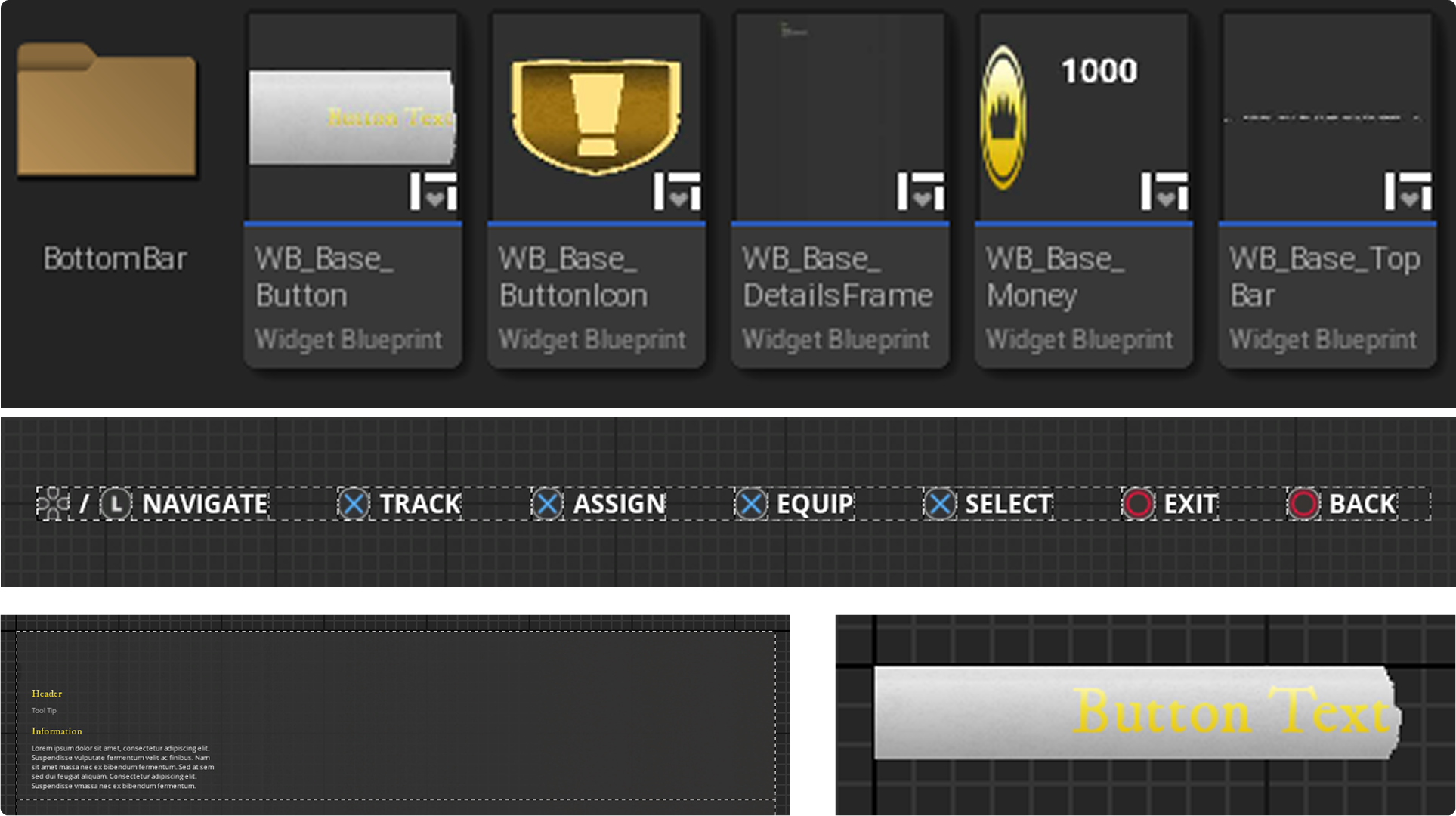
Edited from Details
I set up all the bases with variable on all elements that needed to be changeable from where the base was in use.
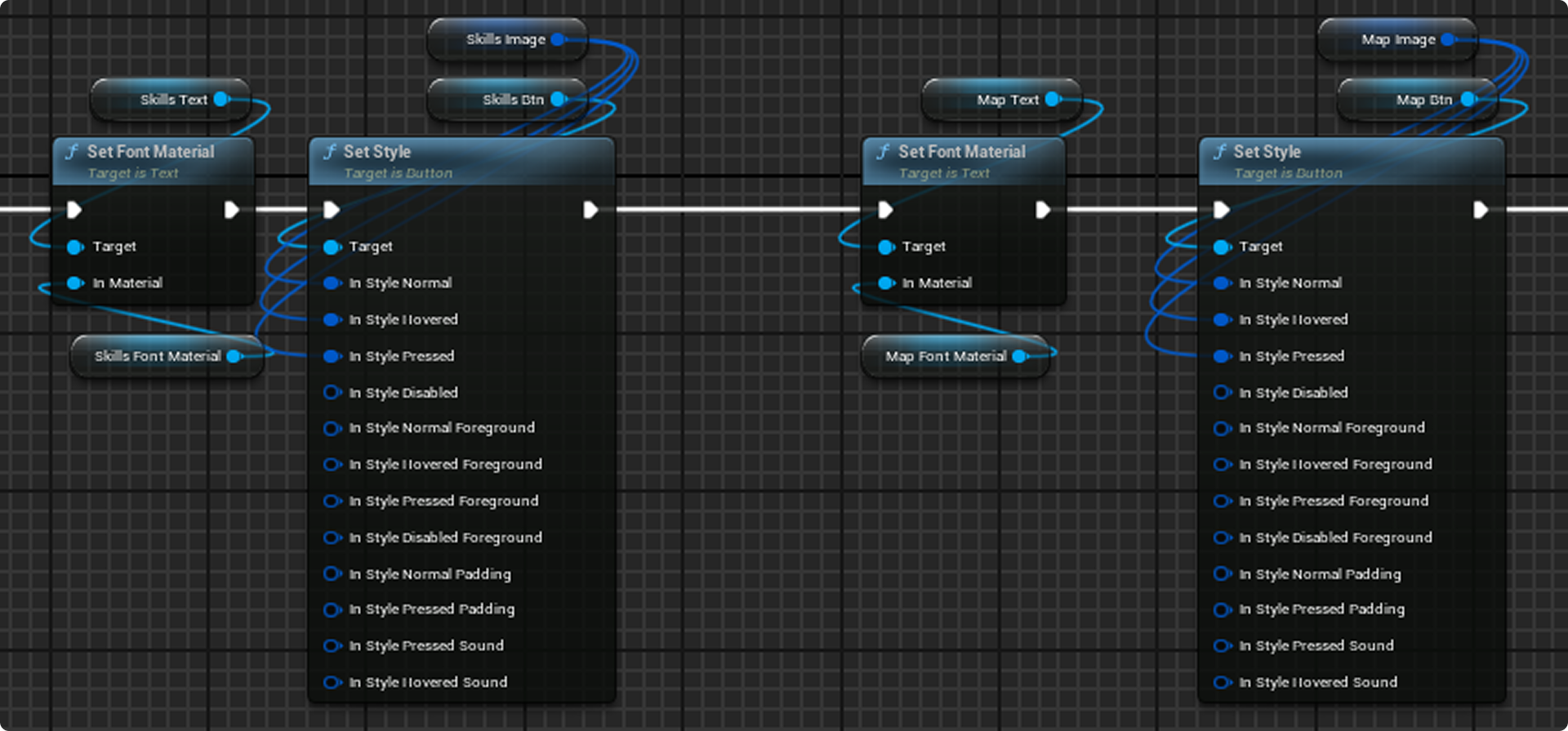
Basic Structure
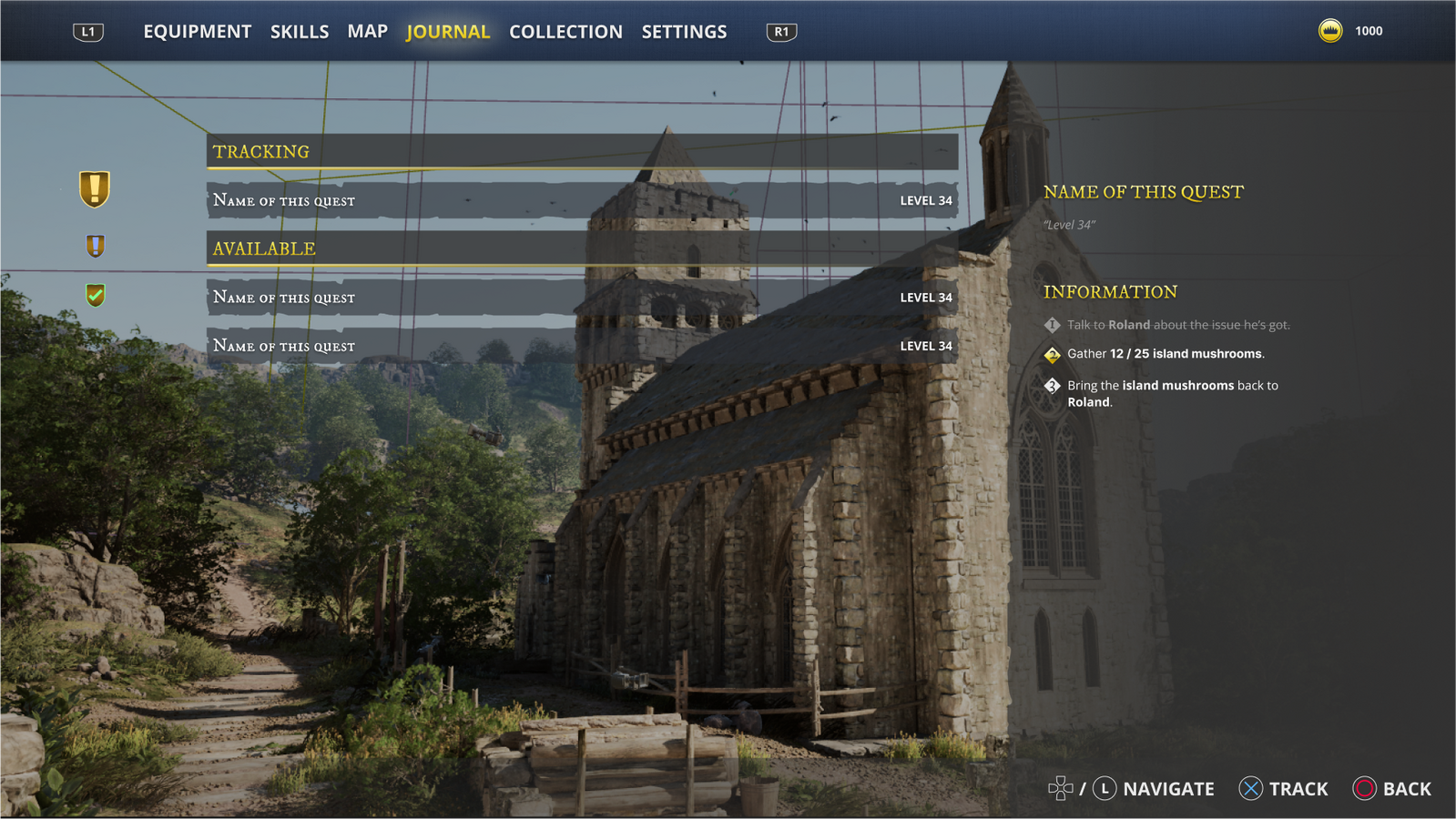
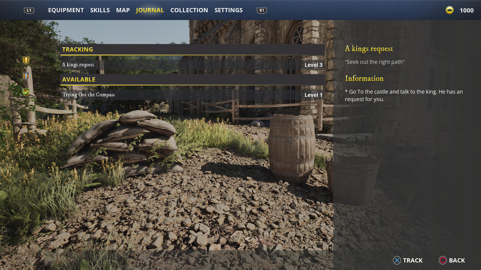
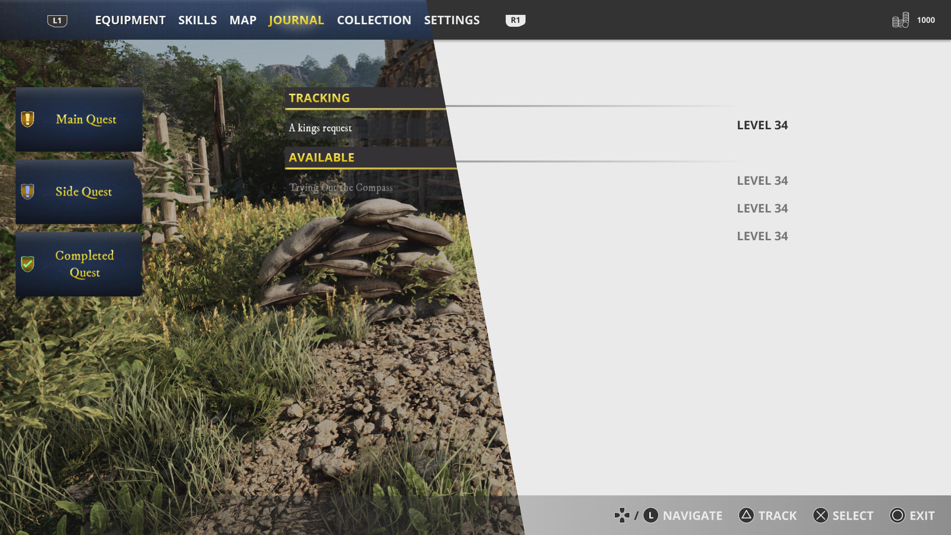
In planning this project, we chose to design the menu for console first, as it’s easier to port to PC later, This is a common approach for most titles in this genre.The menu will have two states: an Overview state to give players a summary of each submenu, and a Detailed state for in-depth information and customization.Since we were two designers working on different screens, we created a strict layout grid to follow, which helped us achieve a cohesive UI.
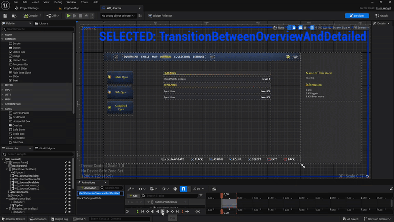
UI Animation
I created a UI animation to smoothly transition between these states visually.
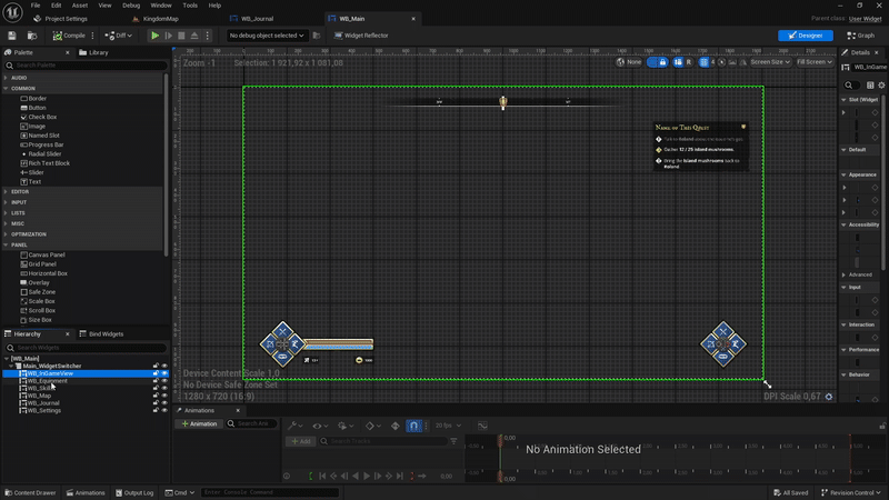
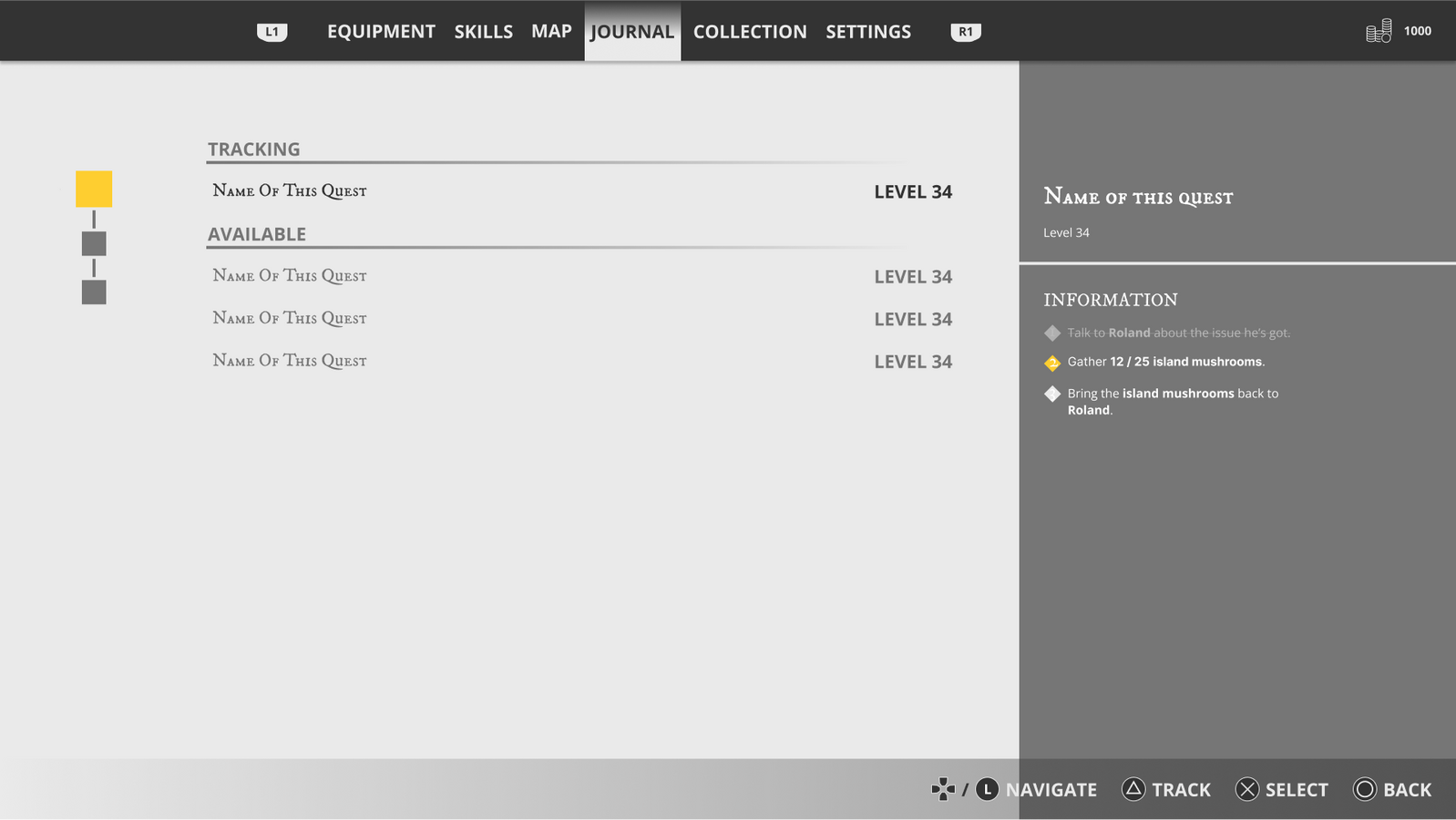
Widget Switcher
I placed all menus in a widget switcher and then added them to an array for easier control
Managing UI
HUD Class
I controlled most states and function from the HUD blueprint.
Initially, This might not be the best way of doing it but for a smaller project like this it worked out fine.
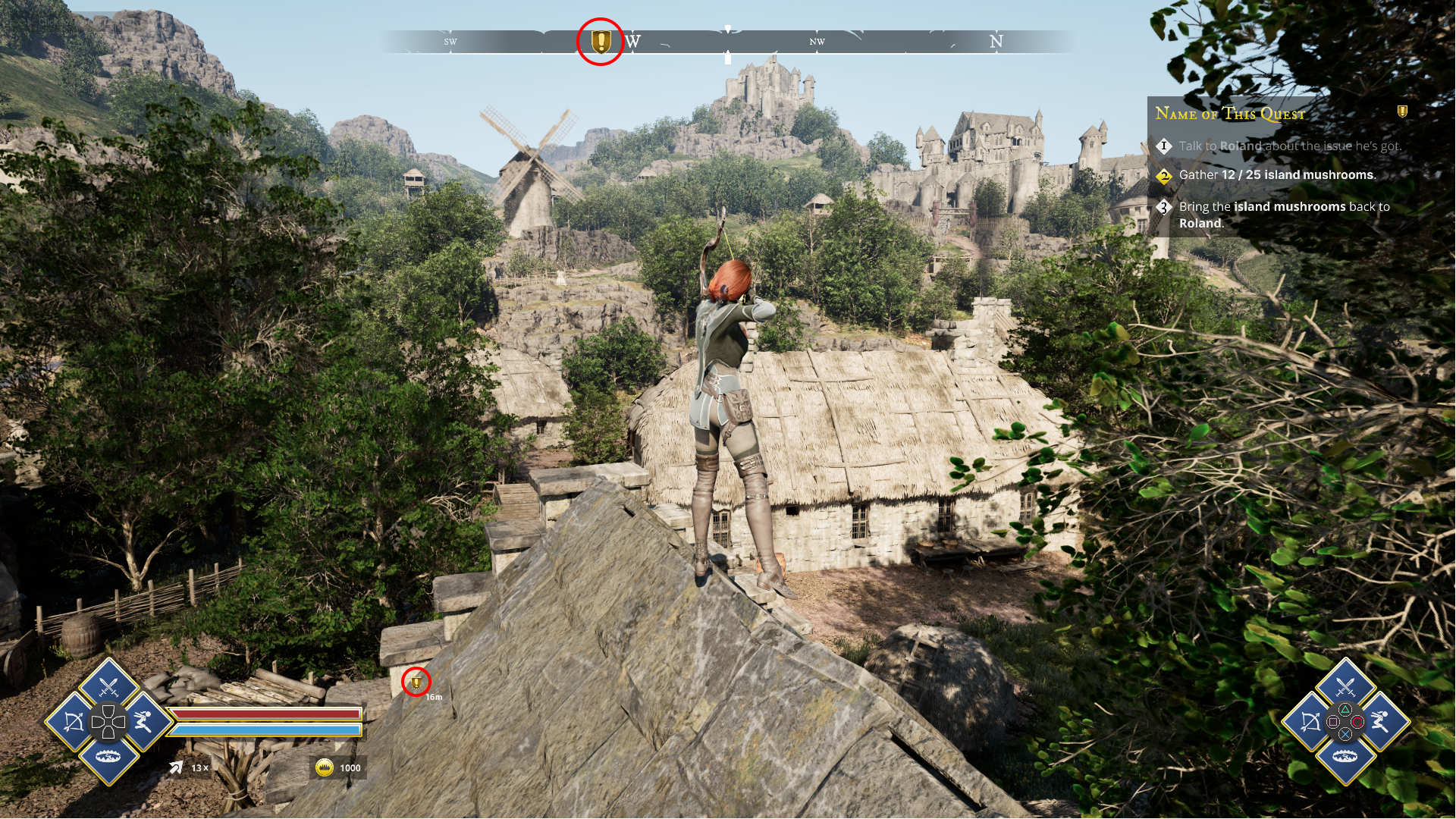
Compass
A compass was easy to conceptualize, but much harder to create in practice, and there are no good videos online that show this in a structured way.
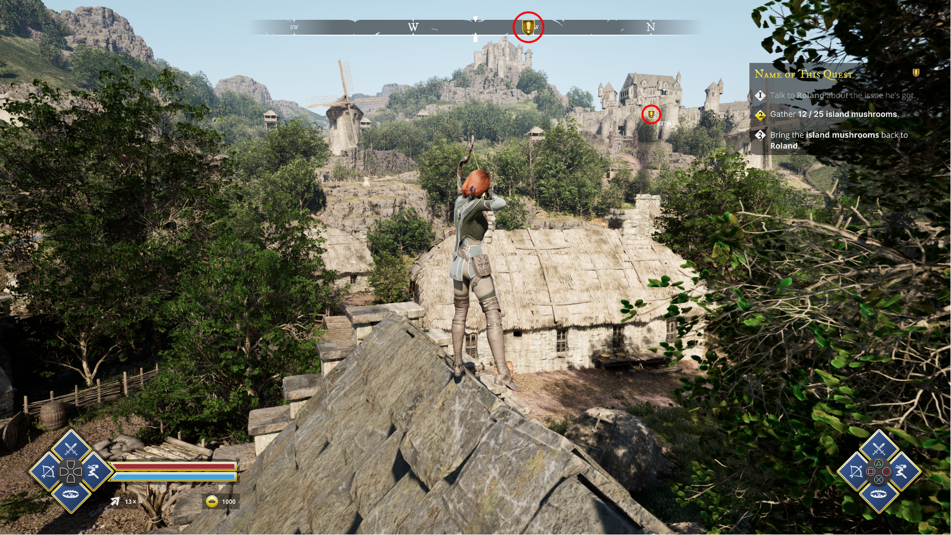
Code
The compass is a widget with two layers, both controlled by a parameter. In the material they are created from. The parameter is accessed via code and updated based on camera rotation. and the quest marker blueprints position..

Cool Factor

Inventory
The original plan for the equipment was to implement a camera spin (New World-style). when opening the inventory.
However, we scrapped that idea for a more cohesive feel. with the other widgets and opted for a camera movement that synchronized with the frame's animation.
Challanges
Github
We encountered significant GitHub issues]{#FF870F} during this project since it was our first time using it. We had to set it up to handle larger files (due to Unreal) and faced file corruption problems.]{#D4AF37
We addressed these by committing frequently, limiting pushes to "only if needed", and creating backups before pushing for added safety.
Contrast Loss
One problem we encountered when transitioning from low to high fidelity was decreased readability in the menus.
We resolved this by implementing dark backgrounds for every UI element
Knowledge
We didn’t have all the necessary knowledge for many aspects of the project, so a significant part involved self-teaching.
For example, I learned how to access the level blueprint from the HUD blueprint to retrieve the camera movement function, allowing it to synchronize with the widget animation.
I also learned of how to use Bases, interfaces and dispatchers.
Take Aways
This project is the one that i have learned the most from during my time at Futuregames. I had a very good partner and friend and could be in both teaching and learning shoes. My key take aways is:
The internet is your best friend for learning new skills for Unreal projects. Since I didn't know how to bring our vision to life, I relied on online resources. By deeply engaging with the knowledge, I learned as I worked.
Feedback is key. To really have an open discussion and not be set into any ide to early is what will take a project to the next level.
Designing UI for consoles brings unique challenges. Particularly in making it feel intuitive and ensuring the backend accurately identifies the focused element. I couldn’t fully solve this in this project due to scope adjustments, but I’m eager to tackle it in the future and already have some ideas on how to approach it.
Low Polly TD

Overview

Title
Lorum ipsum
Other Projects
This is a collection of small project.
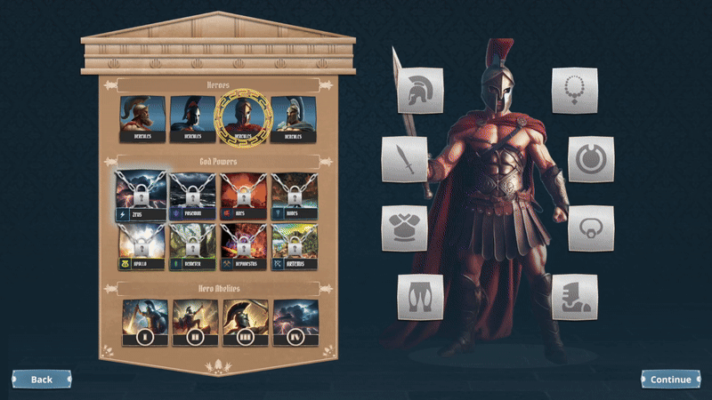
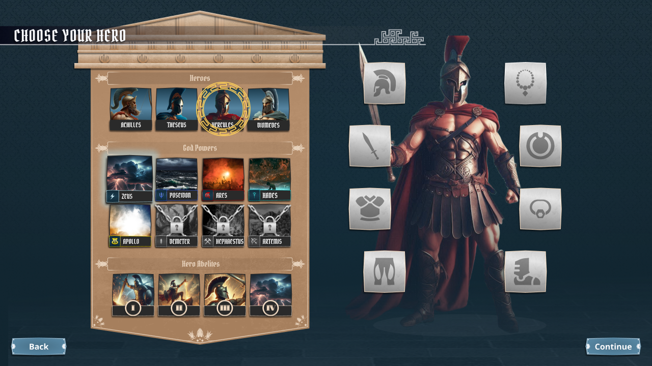
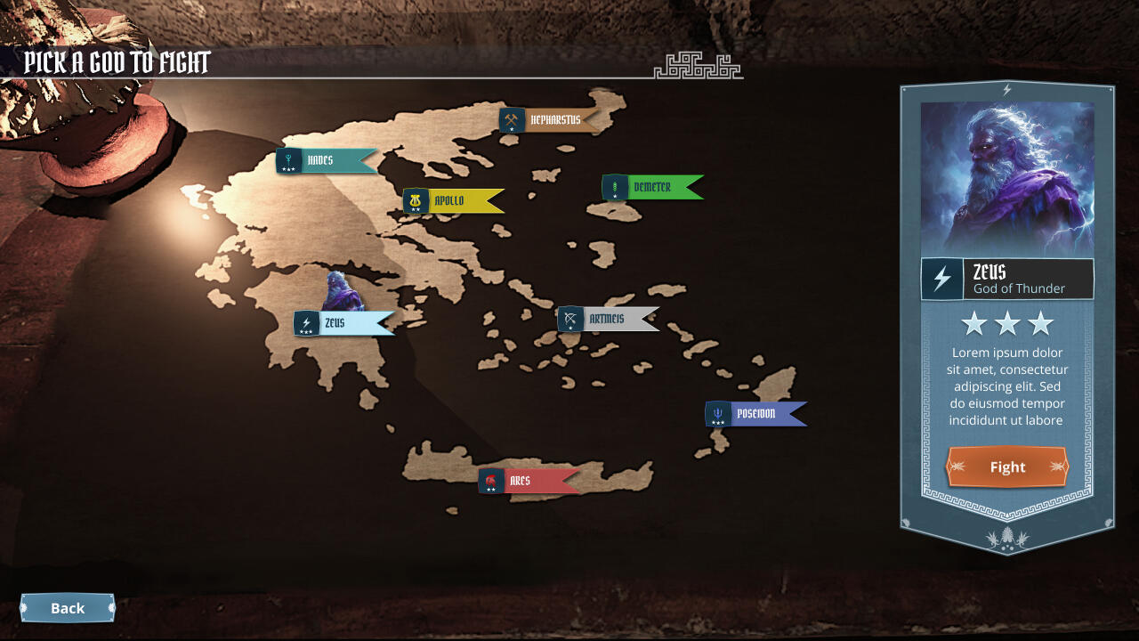
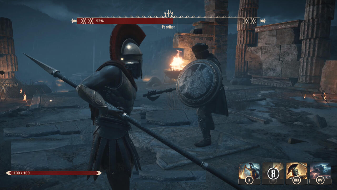
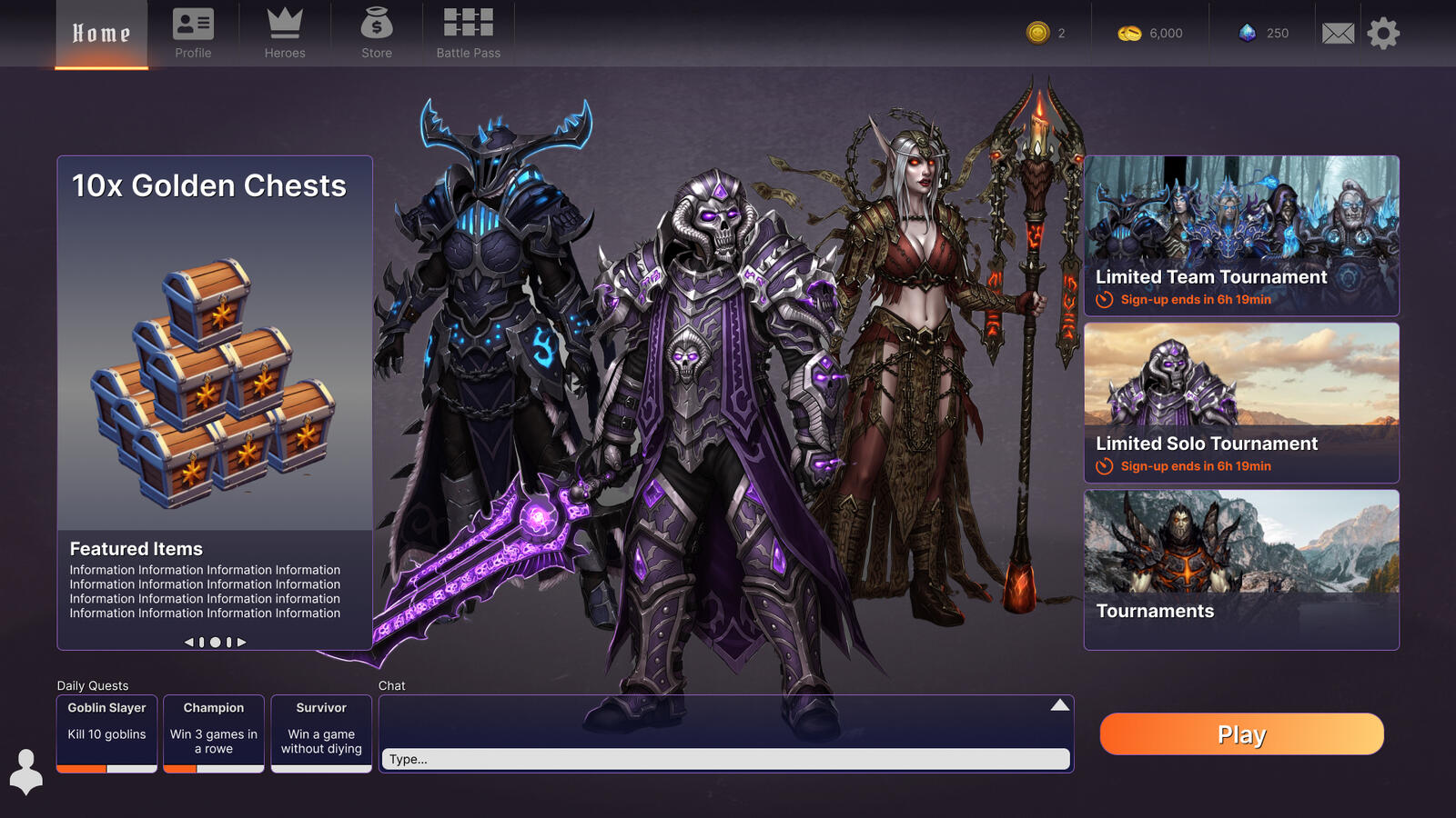
Greek Boss-fight-game
This was 2 week assignment where we were going to work agile and make 4 UI screens for a Greek boss fight game.We were a team of 2 and we worked together on most of the screens.I did all art except the AI generated images. Panel details and button details, we used some textures we found online to make the UI look more polished.All UI design on "inventory/ hero selection" and The "HUD".
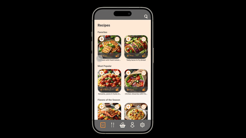
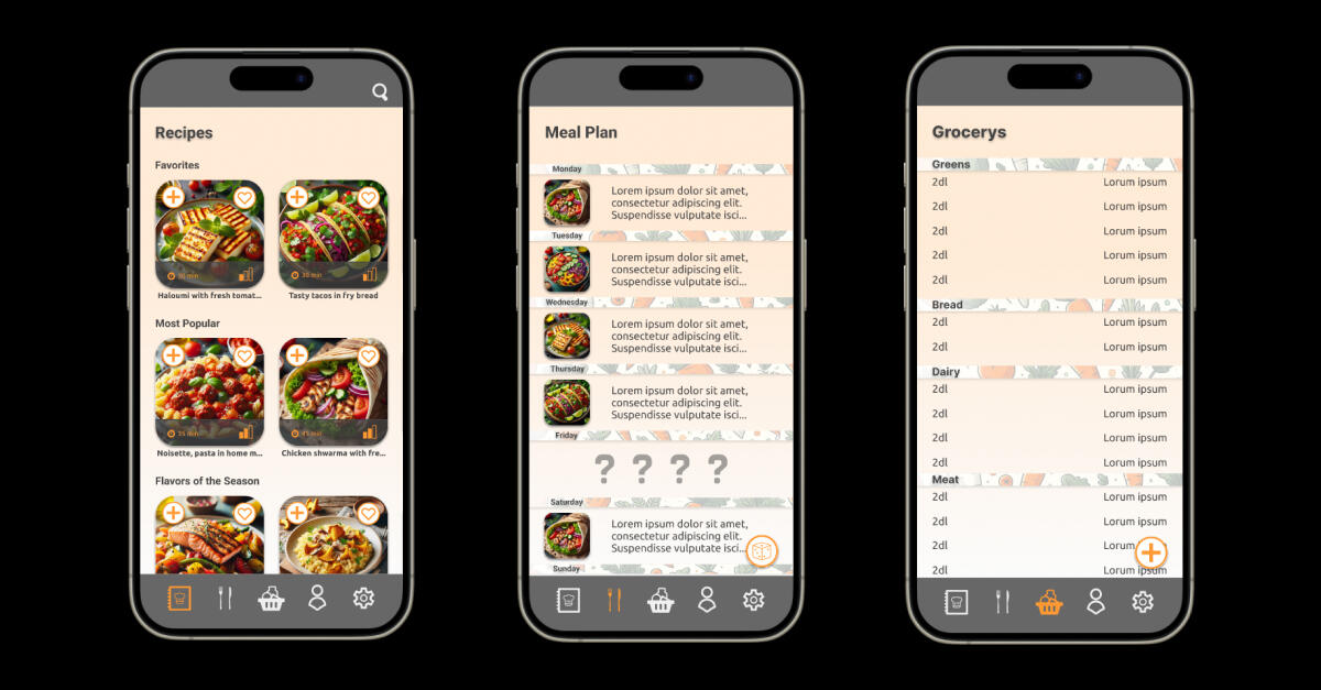
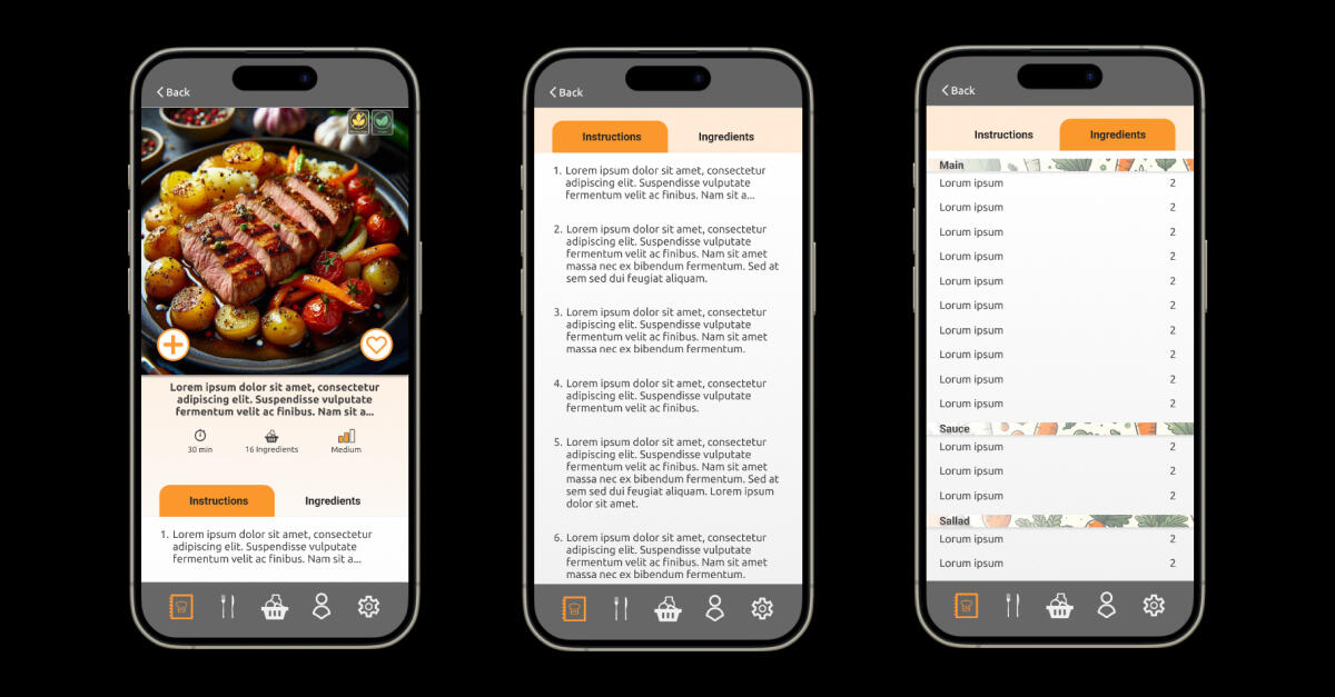
Gamified Grocery App
This was a 1 week assignment that a did with 2 other students.This was a pure Figma assignment.All that is showcased is my contributions to this project.

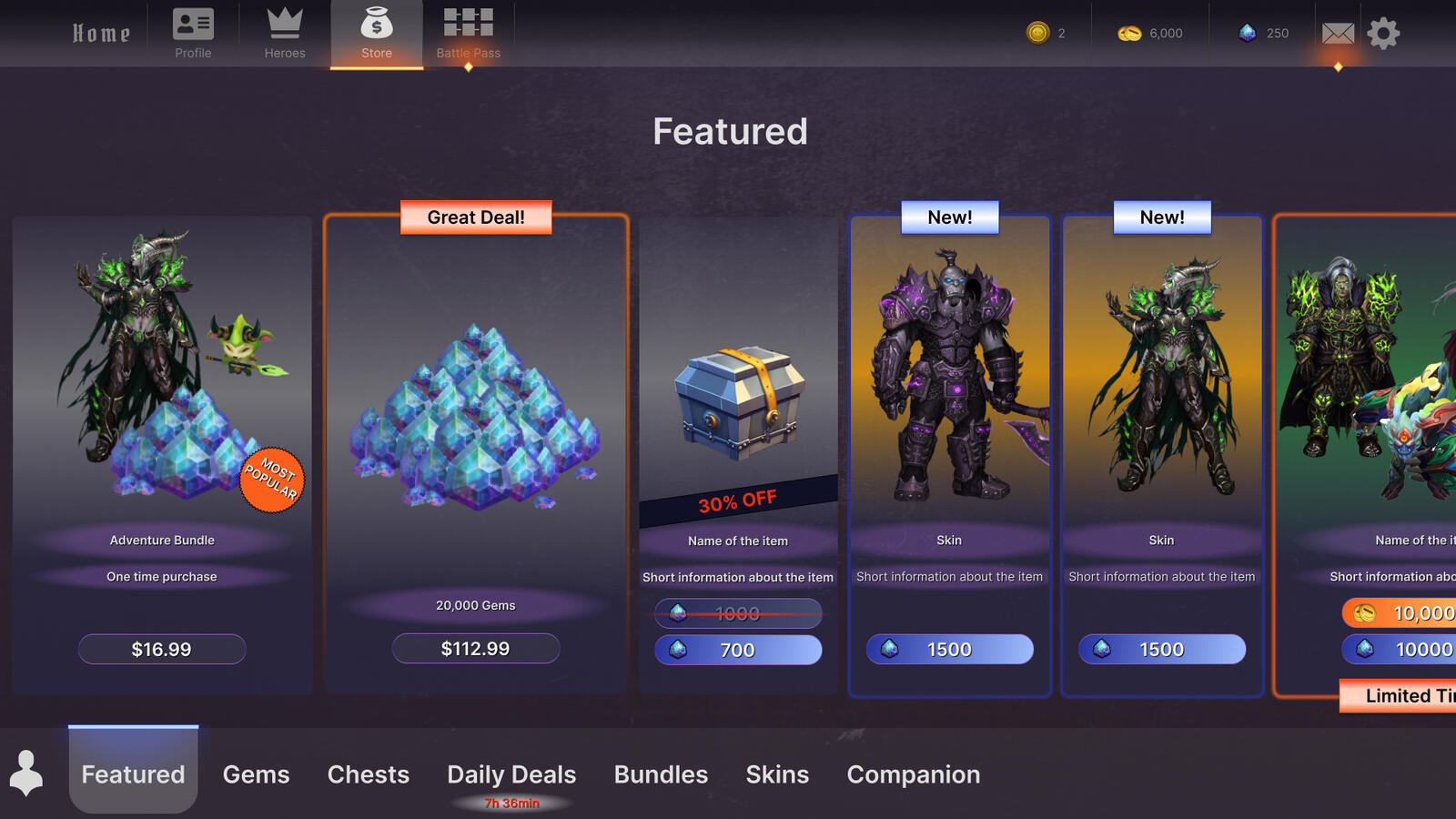
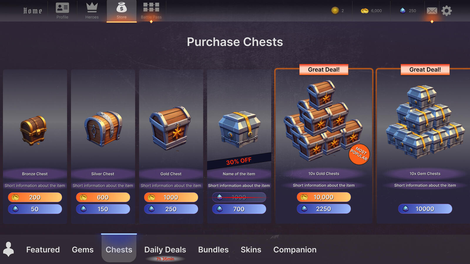
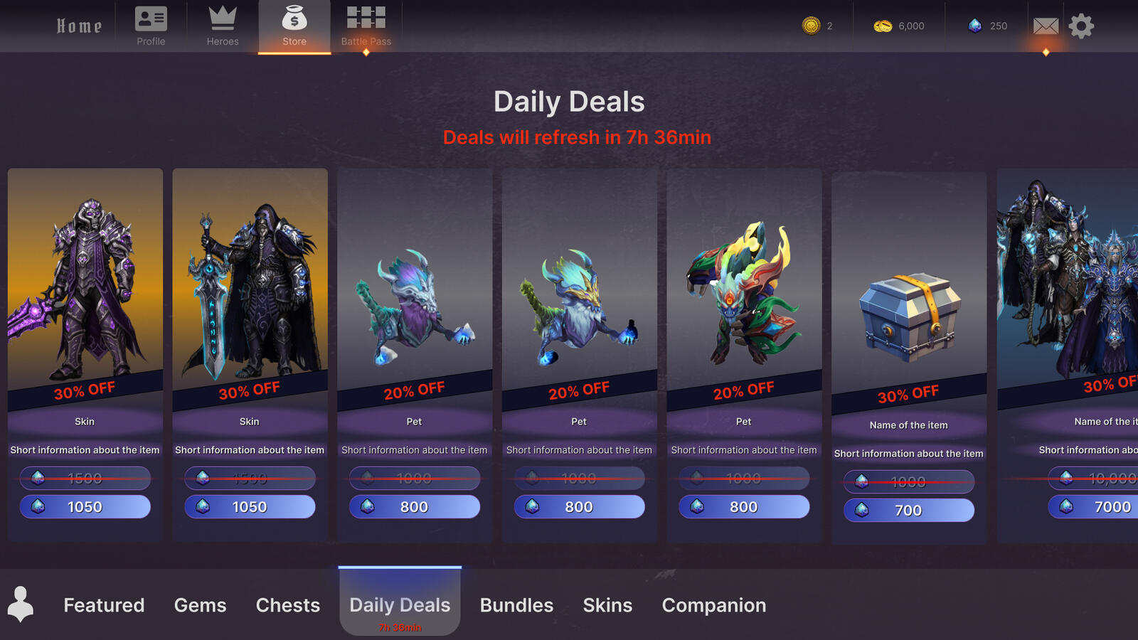
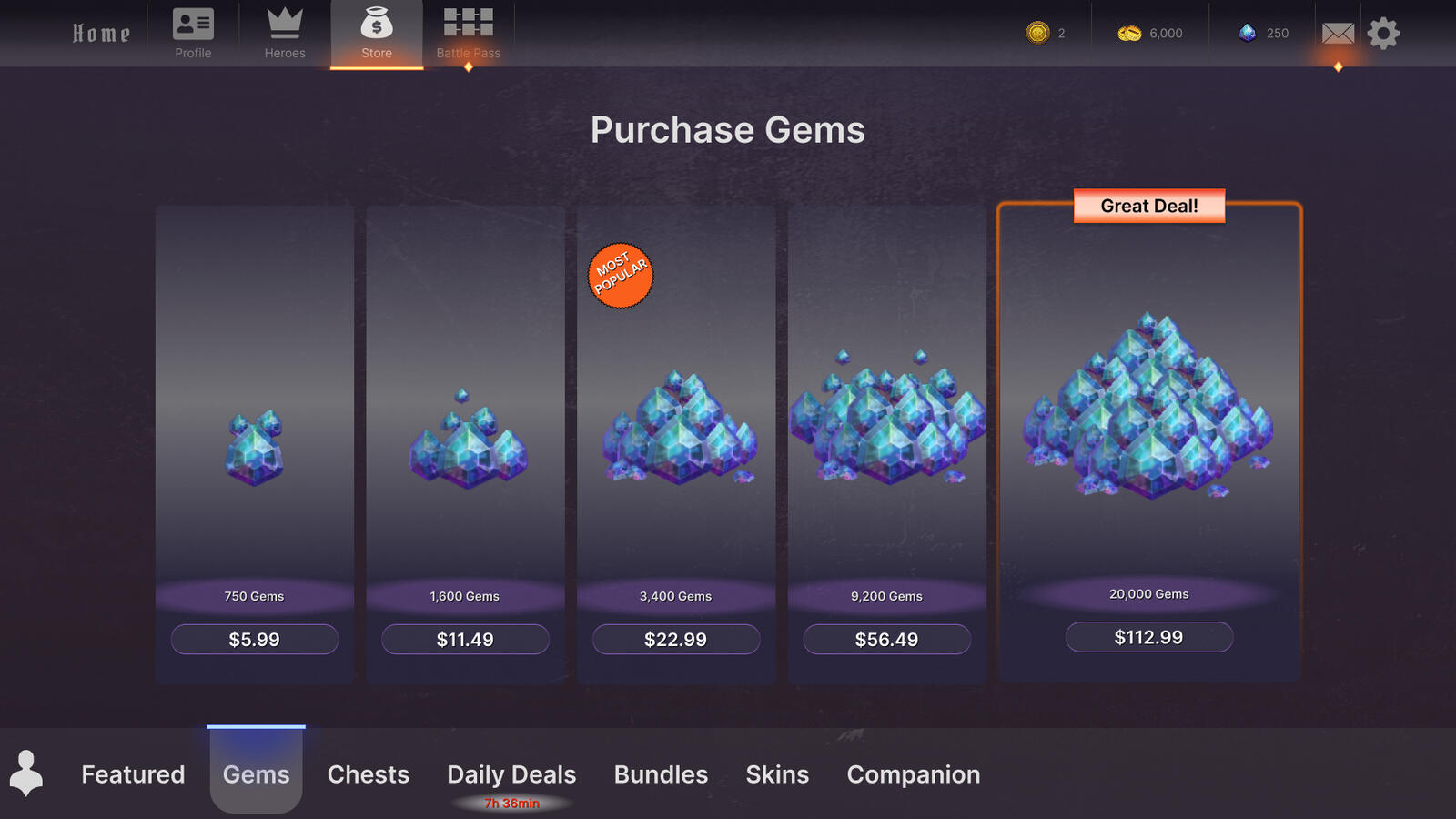
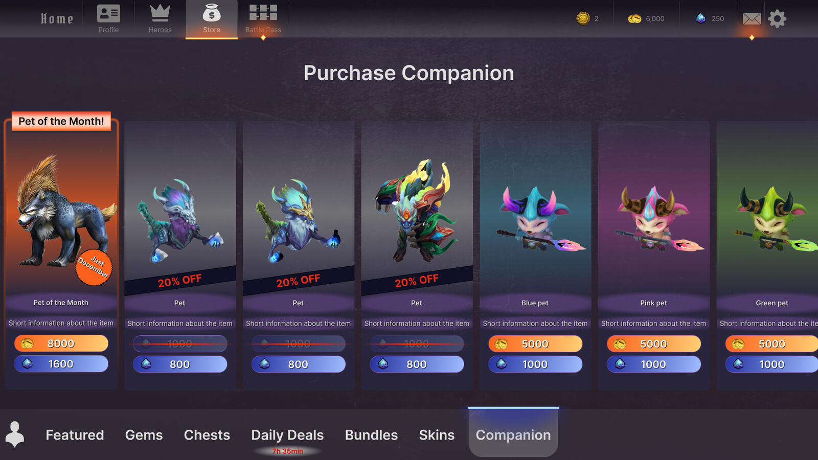
Game Shop
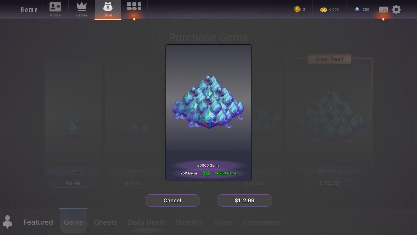
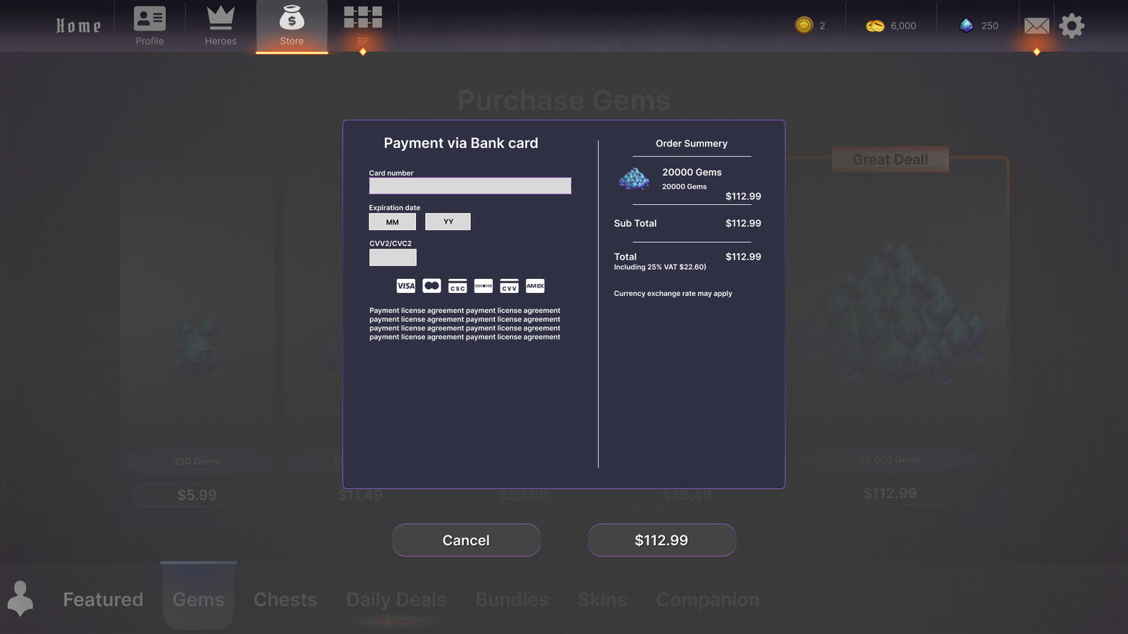
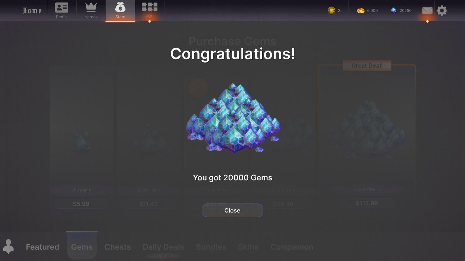
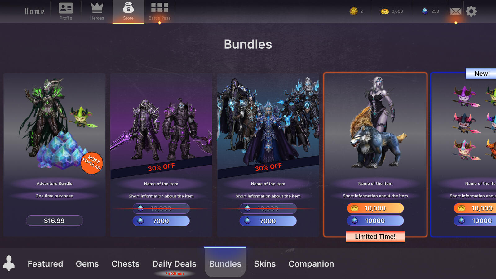
This was a 4 week solo assignmentFirst two weeks was to wireframe low and high. and found good images to use from the internet.
The second two was to implement to the engine (Unity).This was the first real UX challenge we had at the education and I put in lots of more hours then 8 to make it happen.A big inspiration to this project was Magic arena.
CV